WOOFIT
I. COMPLETE BRAND IDENTITY
Designed a thick, bold logo symbol for Woofit, a fitness, health, and wellness channel. The mark conveys strength, energy, and confidence, capturing the brand’s active and empowering spirit through clean, modern design.
THE “W” CONCEPT
The “W” in the Woofit logo is constructed from a box-inspired form, representing overcoming obstacles, movement, and progress. This design choice reinforces the brand’s message of strength, growth, and motivation, while maintaining a bold and confident visual identity.
Client
Woofit
Year
09/01/2025


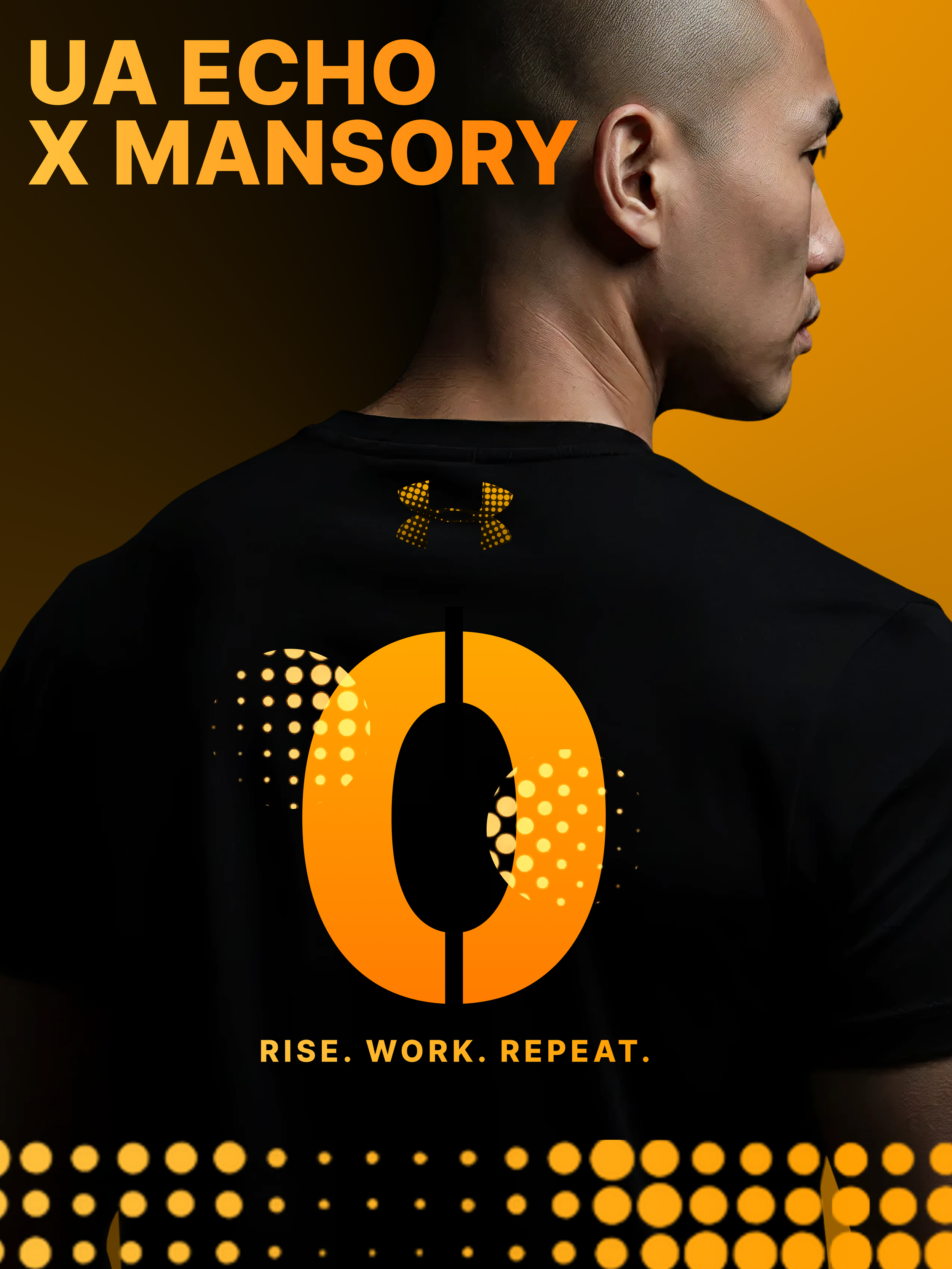
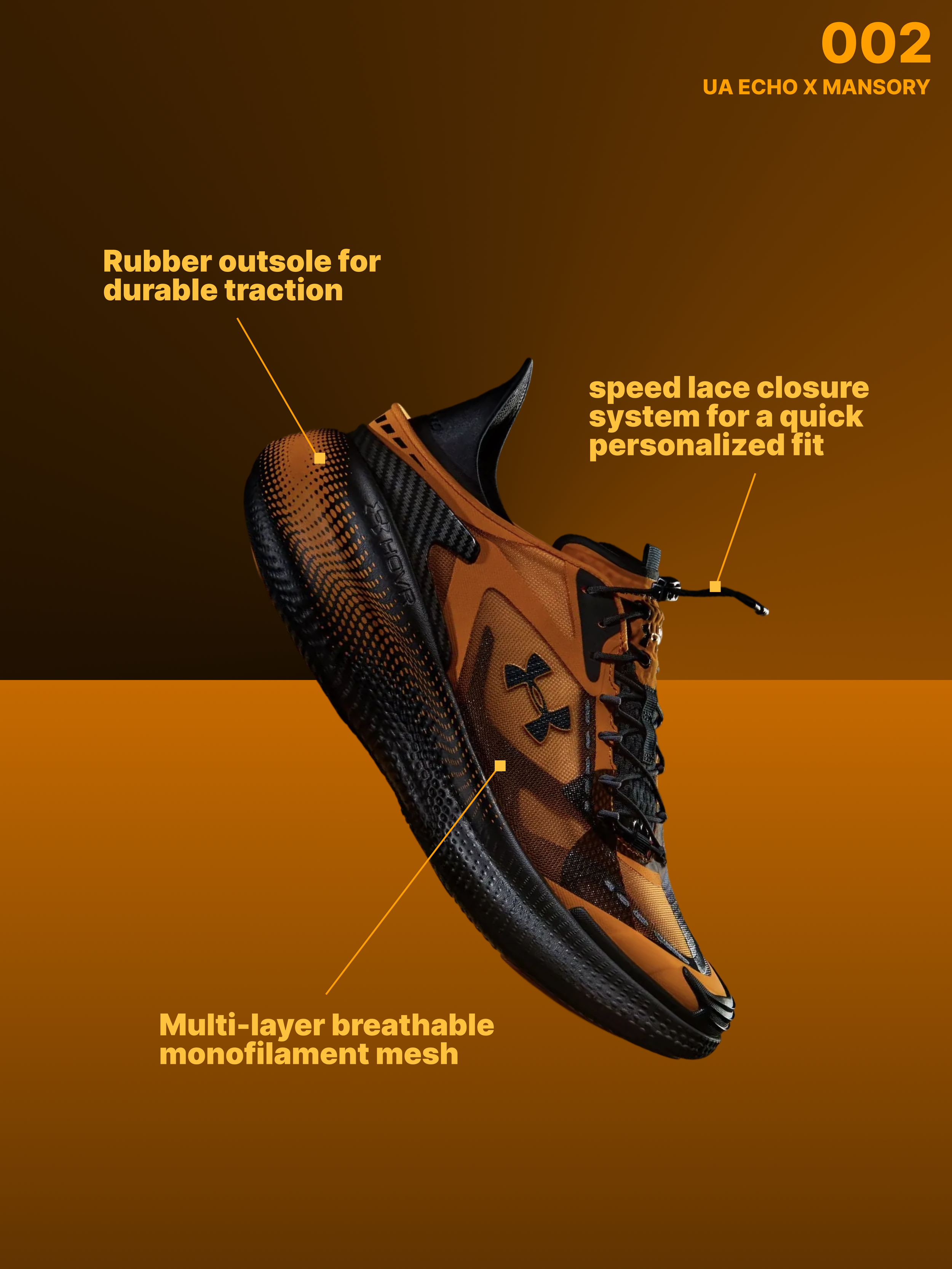
UA CONCEPT DESIGN
Bold concept posters for the UA Echo x Mansory sneaker, blending luxury performance with gritty athletic energy. Dynamic angles, high-contrast typography, and dotted echo textures highlight the shoe’s power and precision, creating a visually aggressive statement built for the grind.
Client
Under Armour
Year
11/24/2025

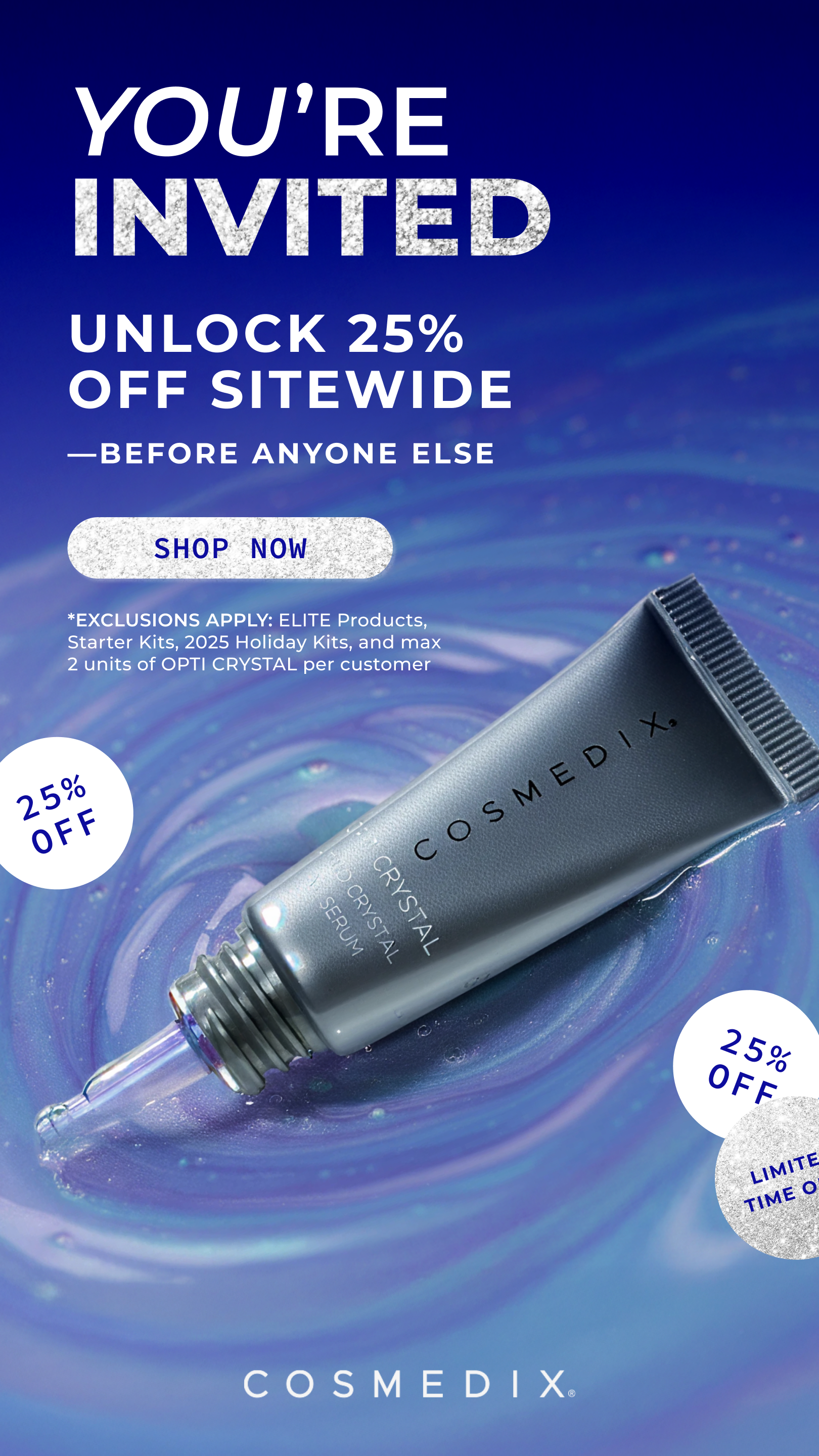
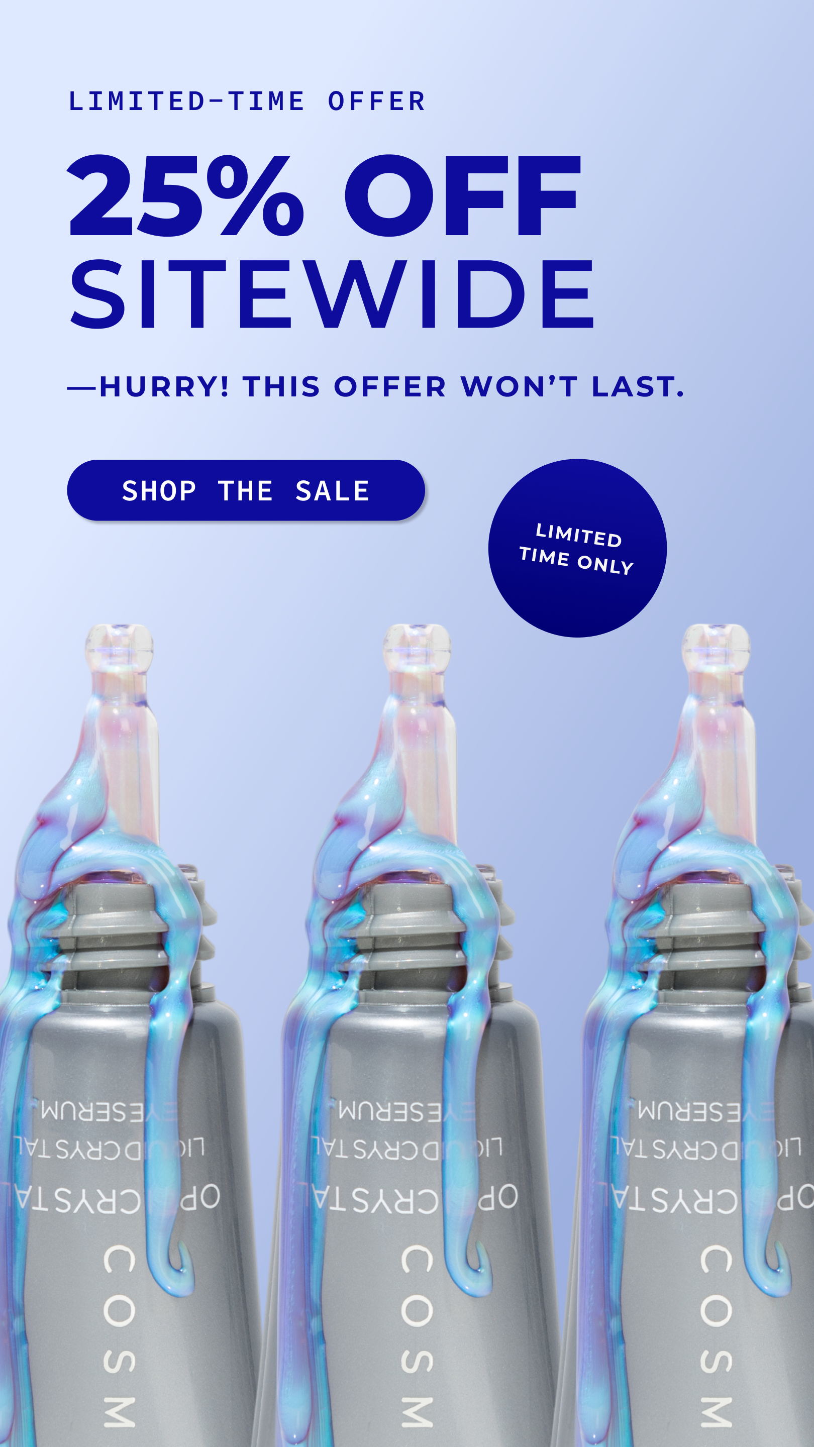
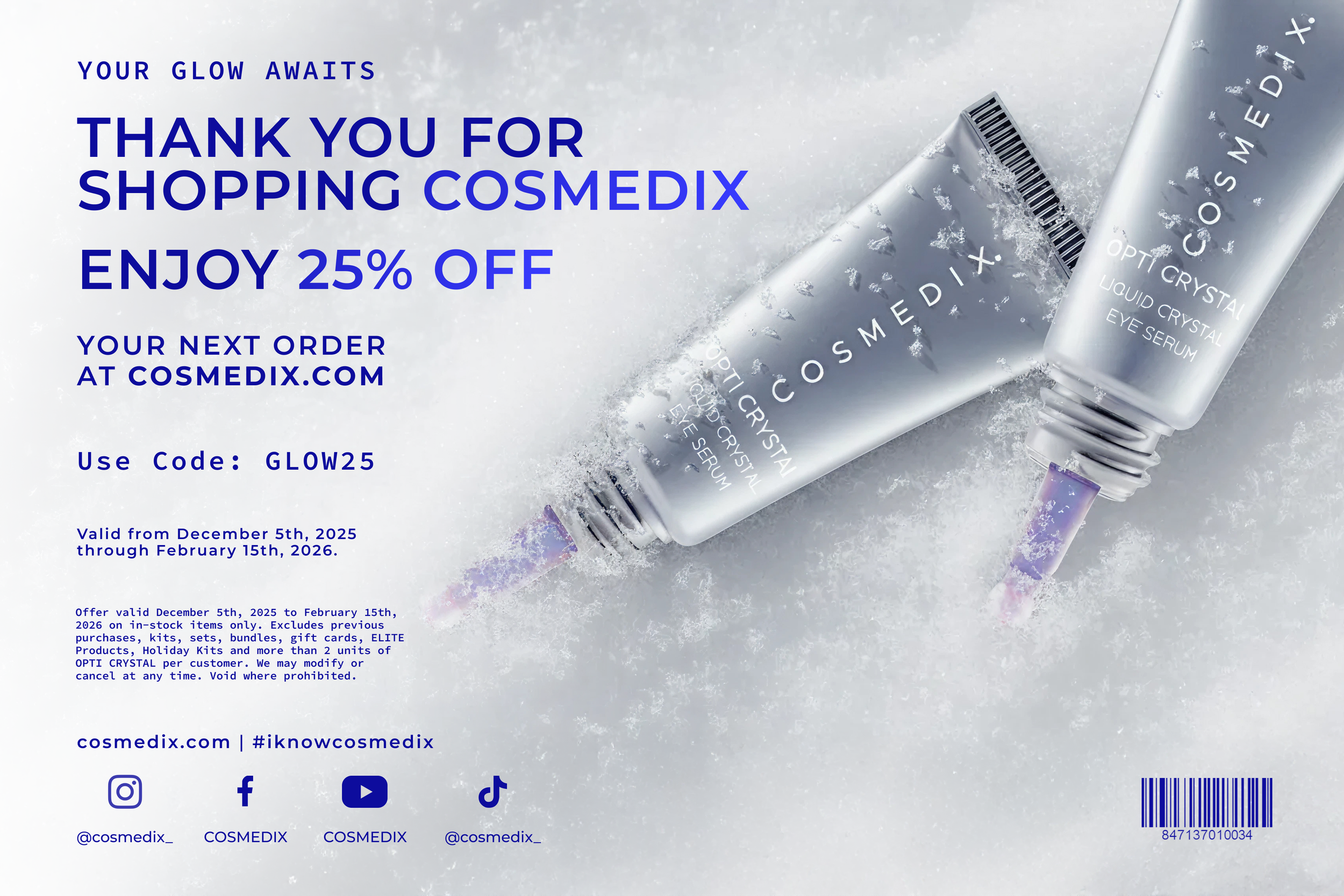
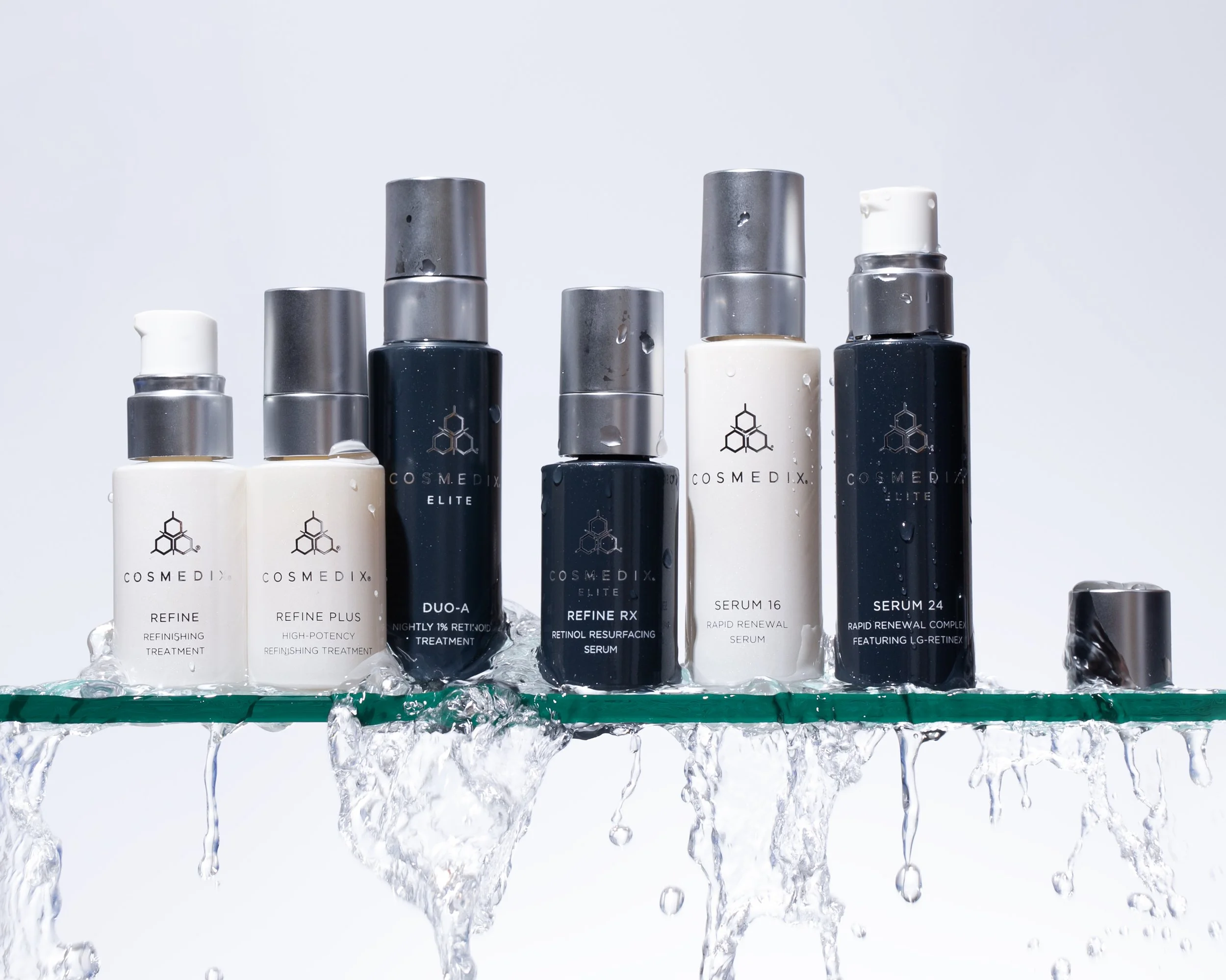
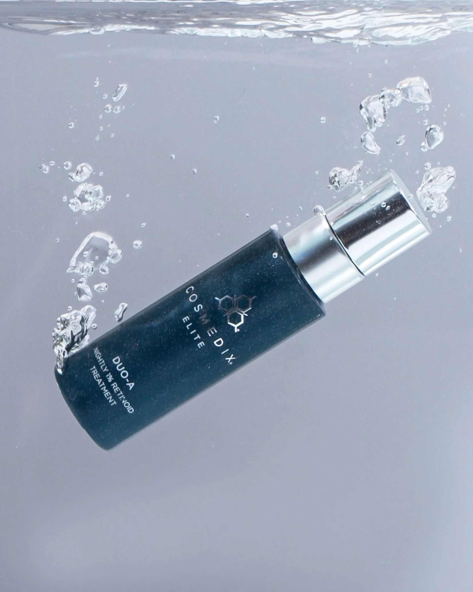
COSMEDIX
II. COMPLETE BRAND REDESIGN
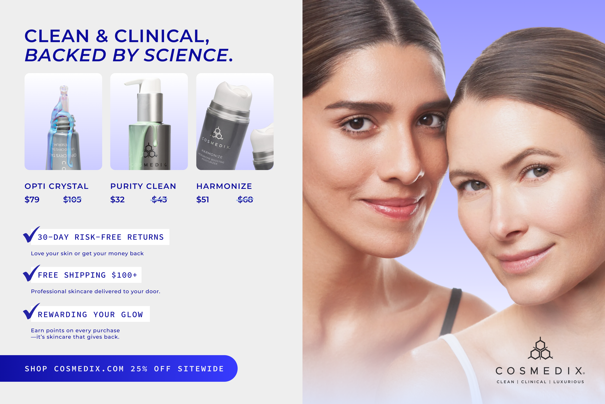
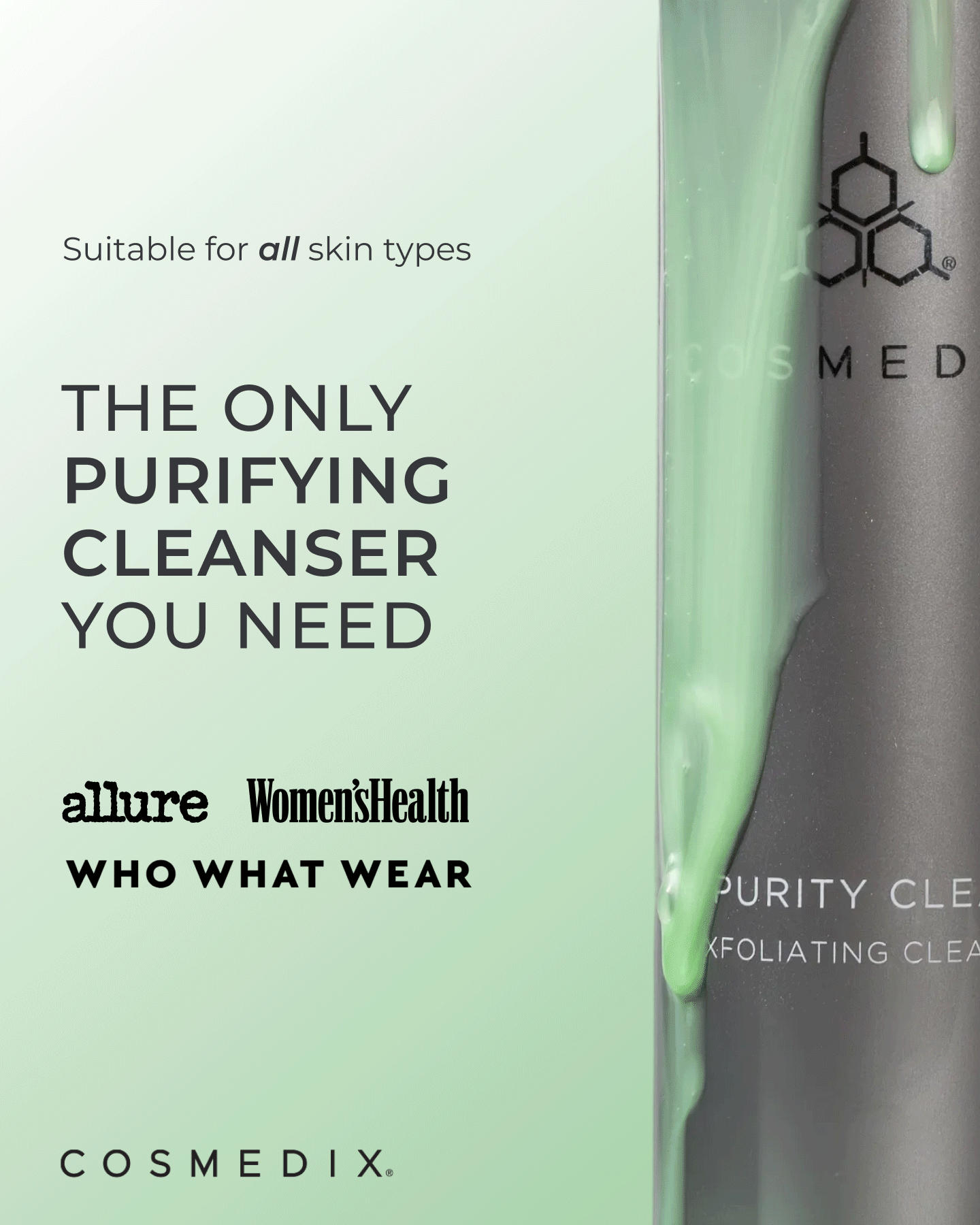
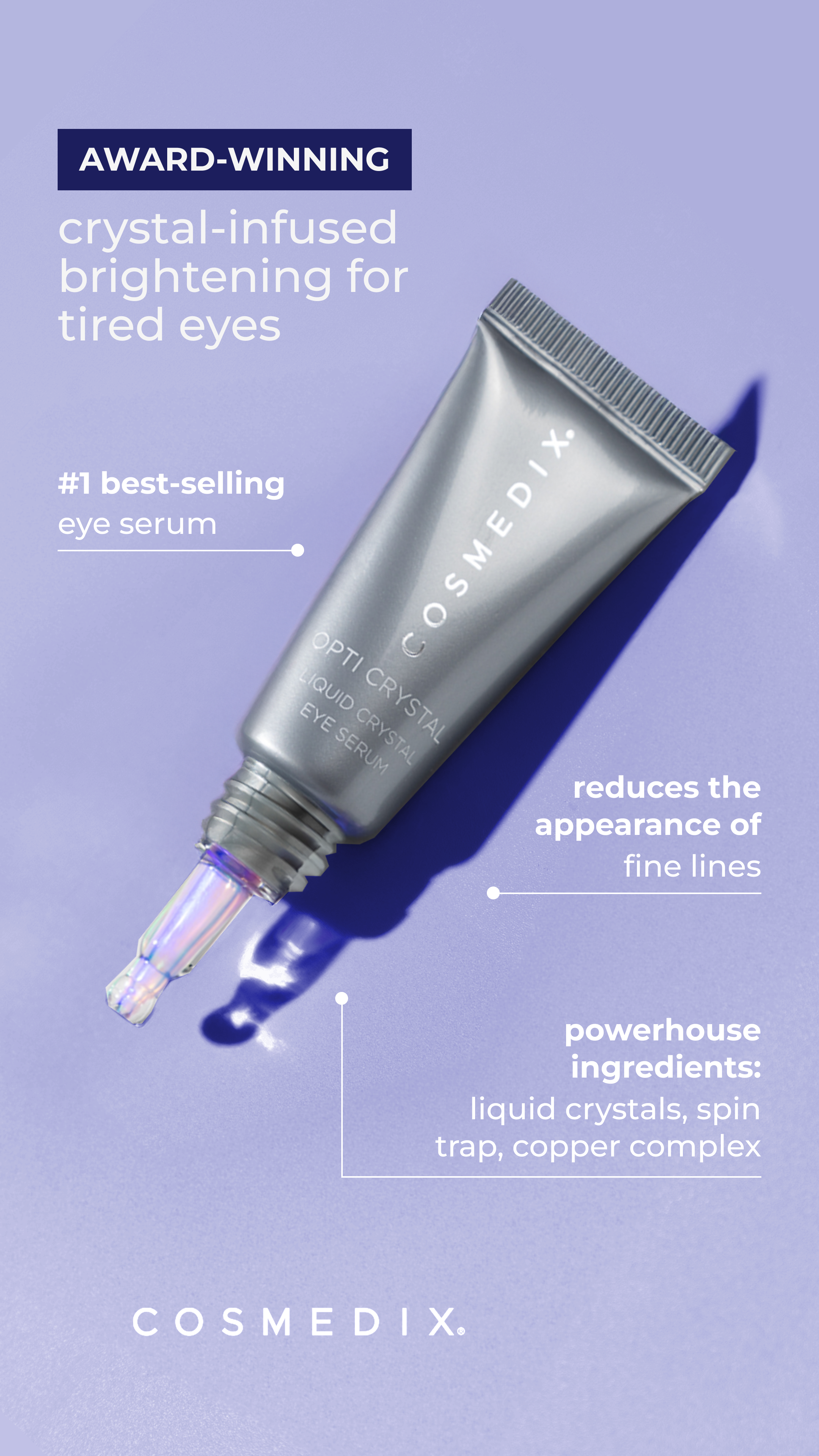
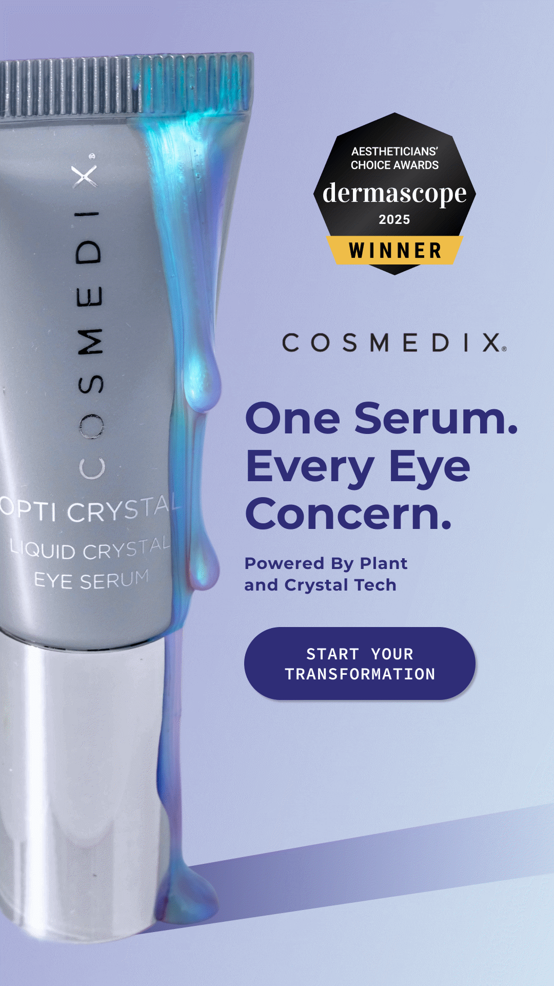
Redesigned the COSMEDIX brand across emails, websites, ads, and print, leading a full rebrand that refreshed photography, color palette, typography, and UI to elevate the brand’s digital presence. Contributed to photoshoot styling, campaign moodboards, and cohesive visuals for product launches and seasonal campaigns.
Landing Page

Banner


Ads

Insert Card
Landing Page
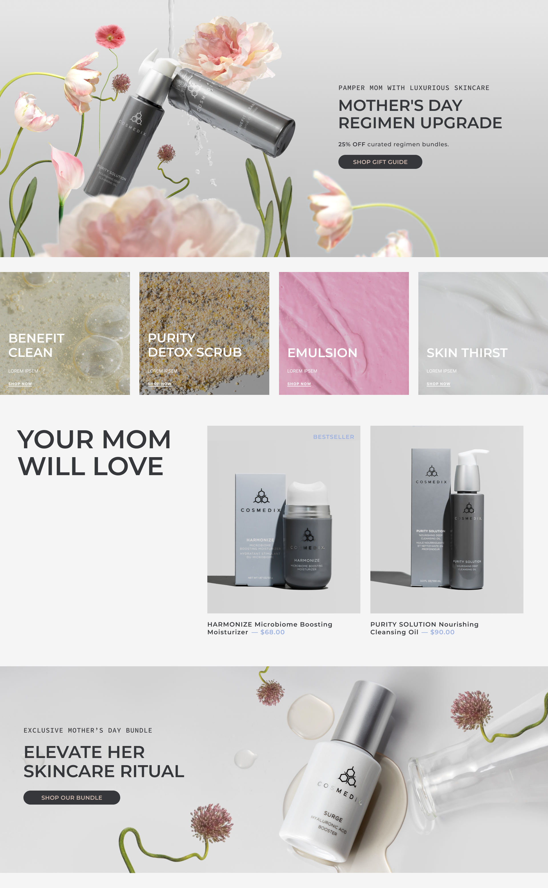
Banner

Ads


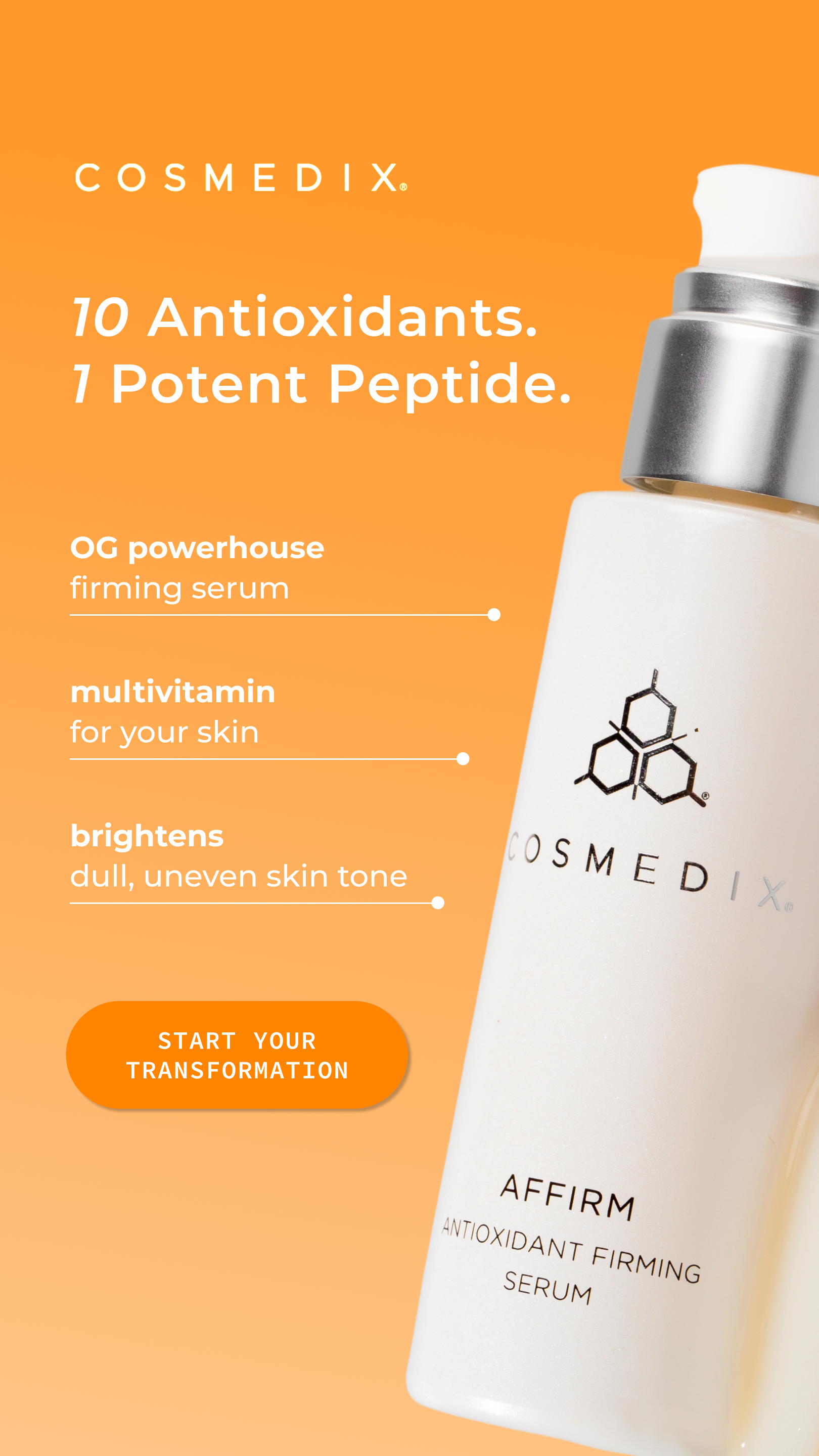

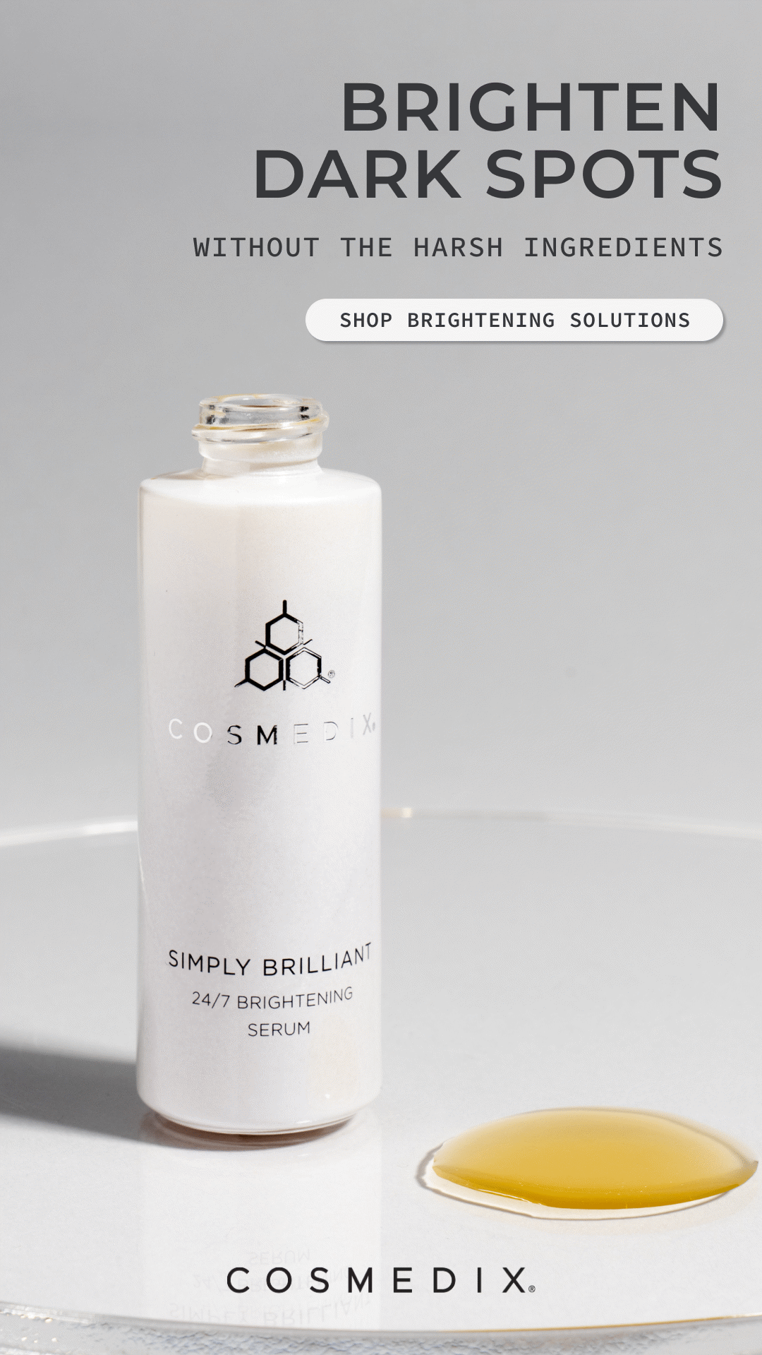

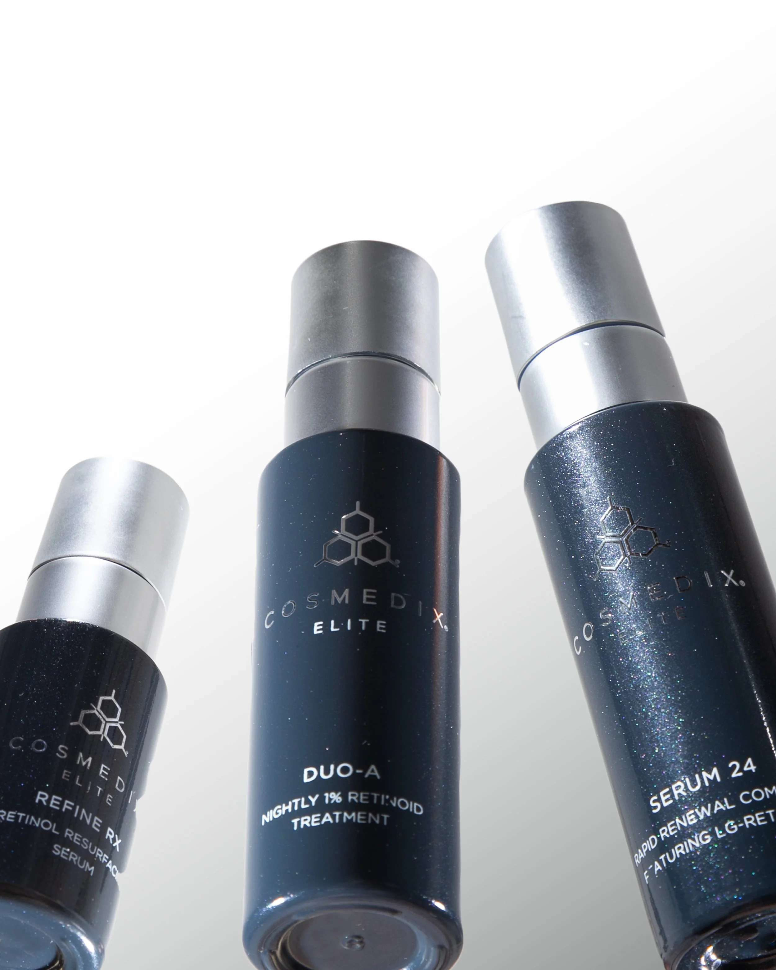
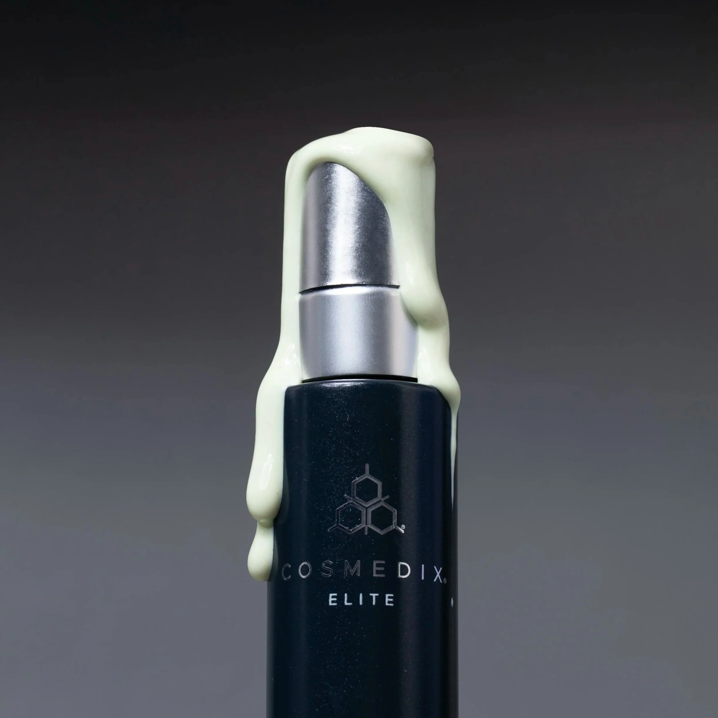
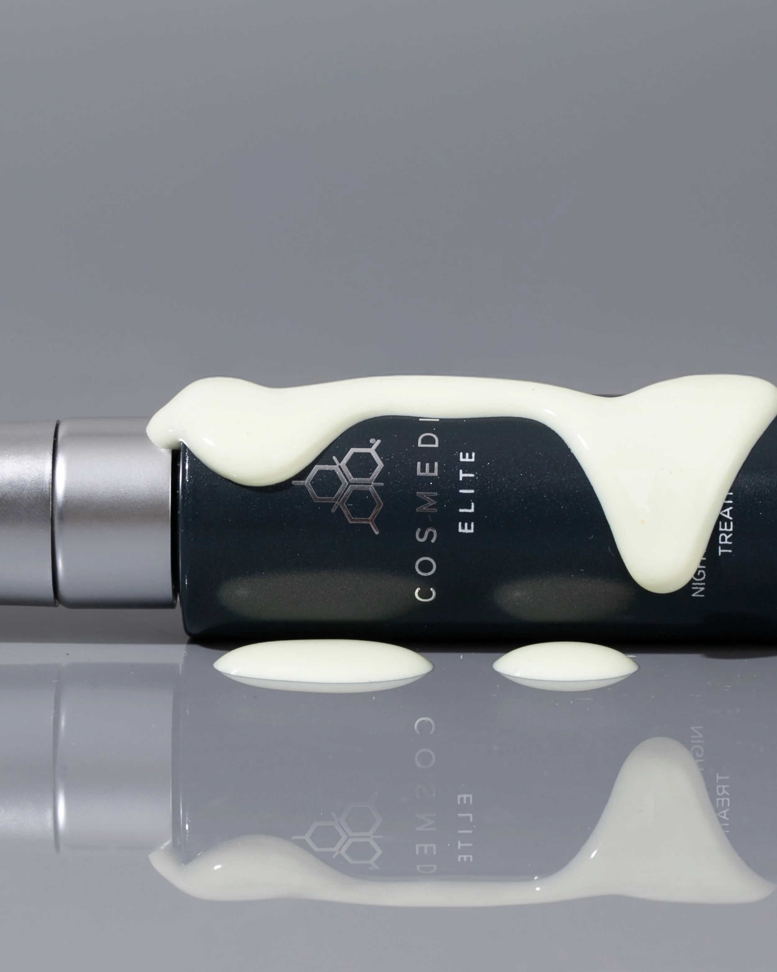
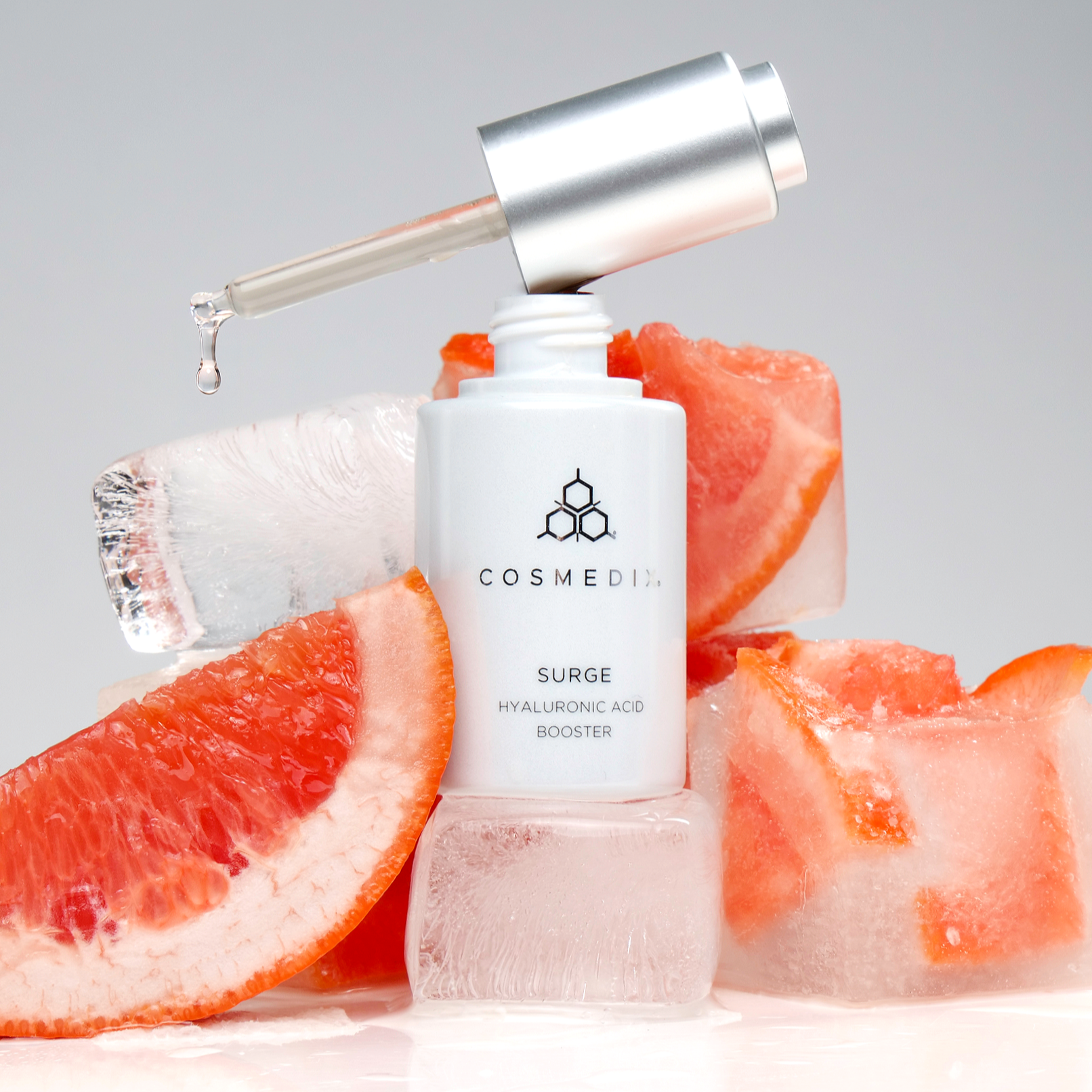
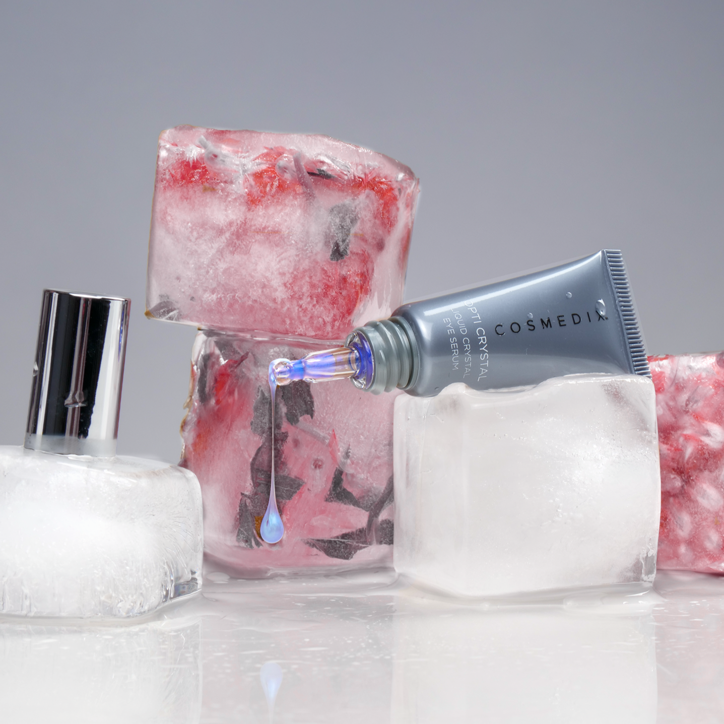
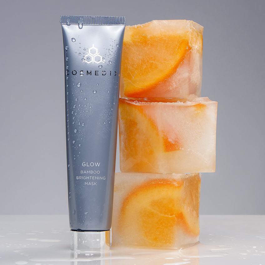
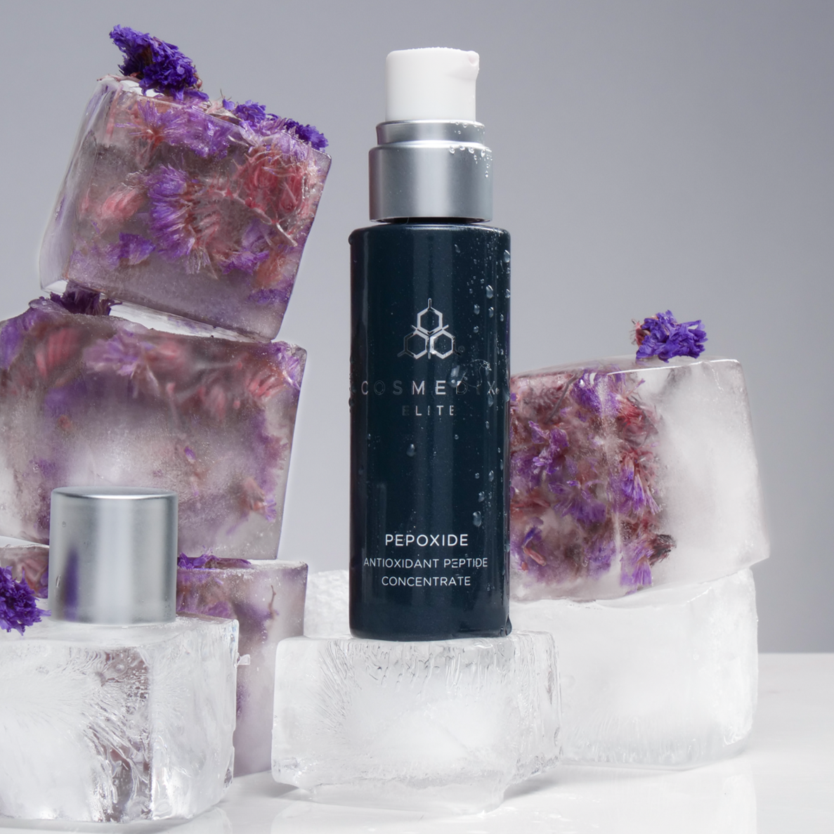
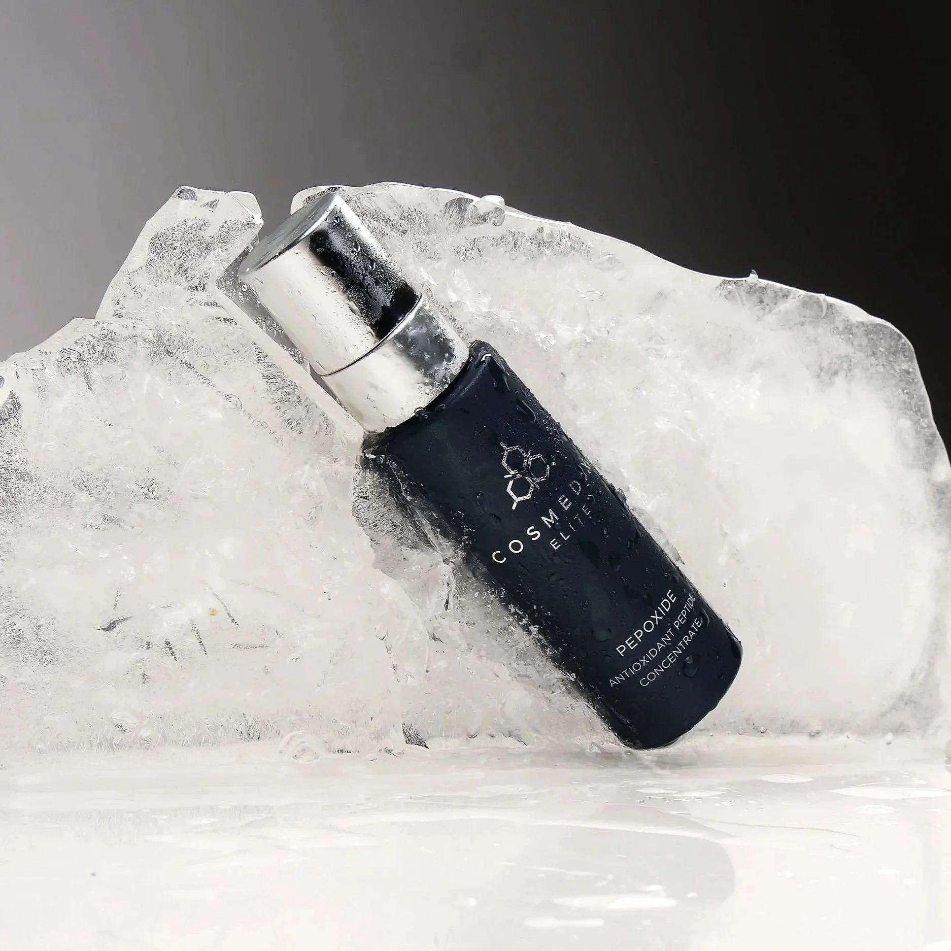
COSMEDIX
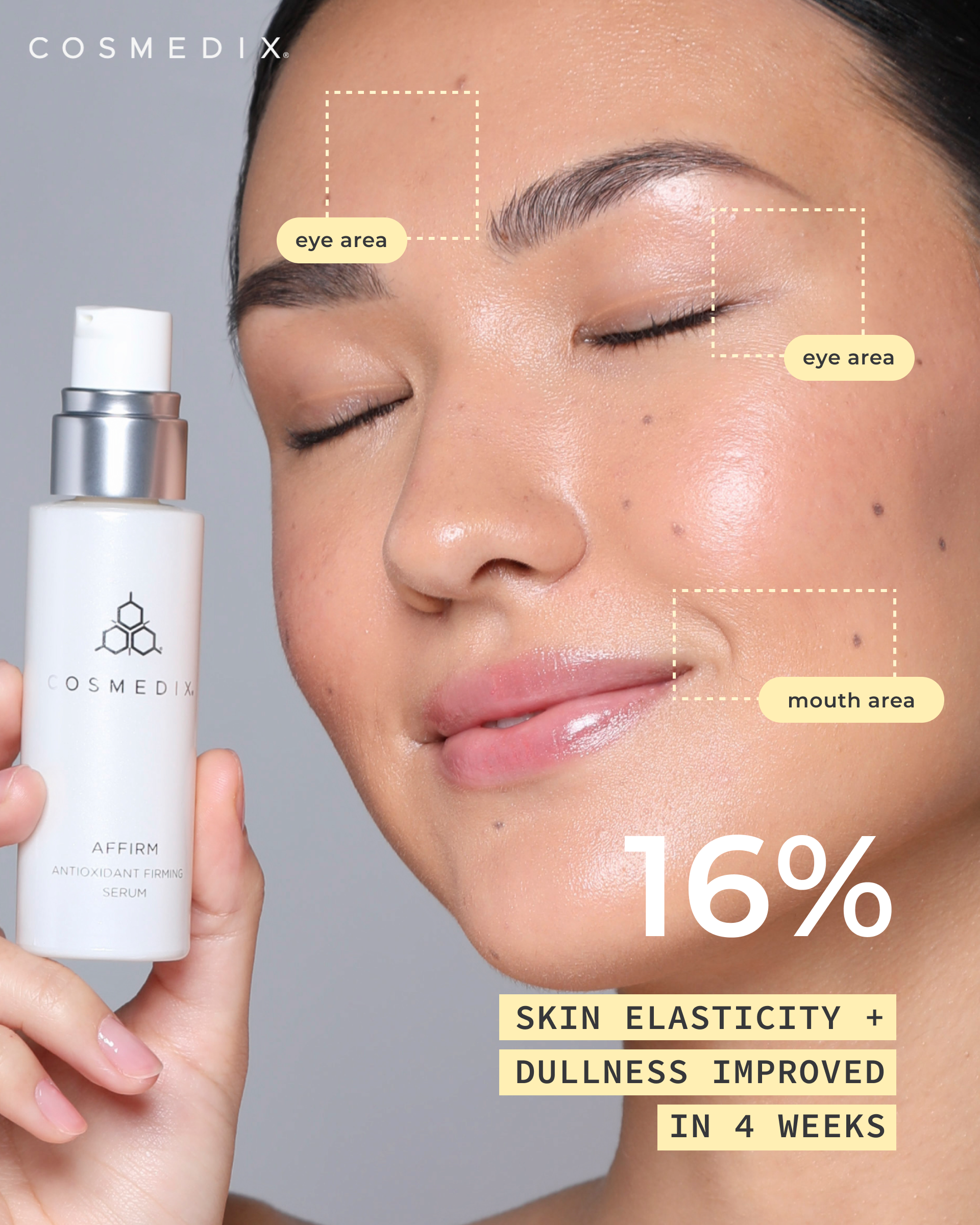
III. COMPLETE PHOTOGRAPHY REDESIGN
SS25 & AW25 - Directed the photography refresh to align with modern day brand standards while still balancing the professional and clinical look. Collaborated closely with the photographer as a stylist to curate and capture the most effective, visually striking shots.


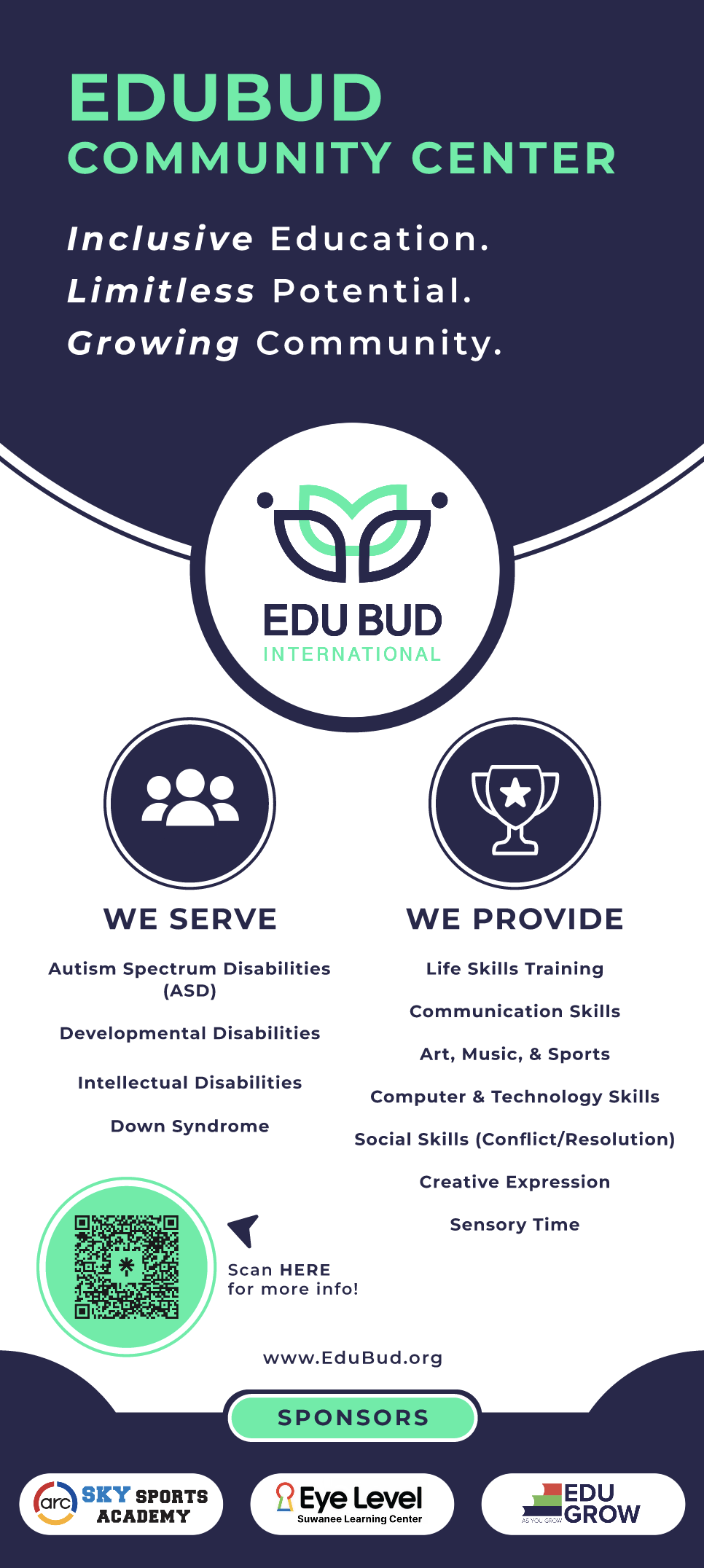
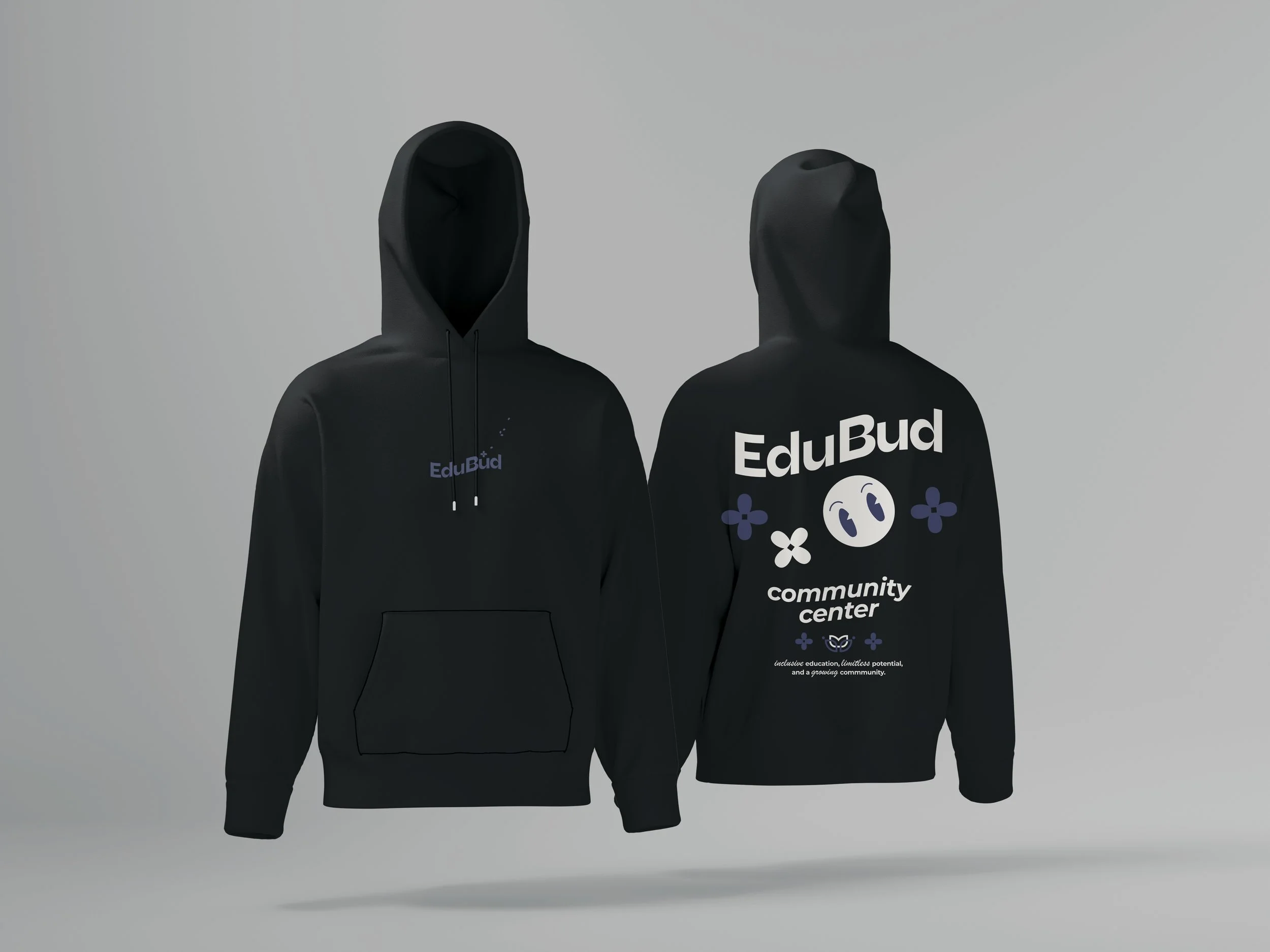
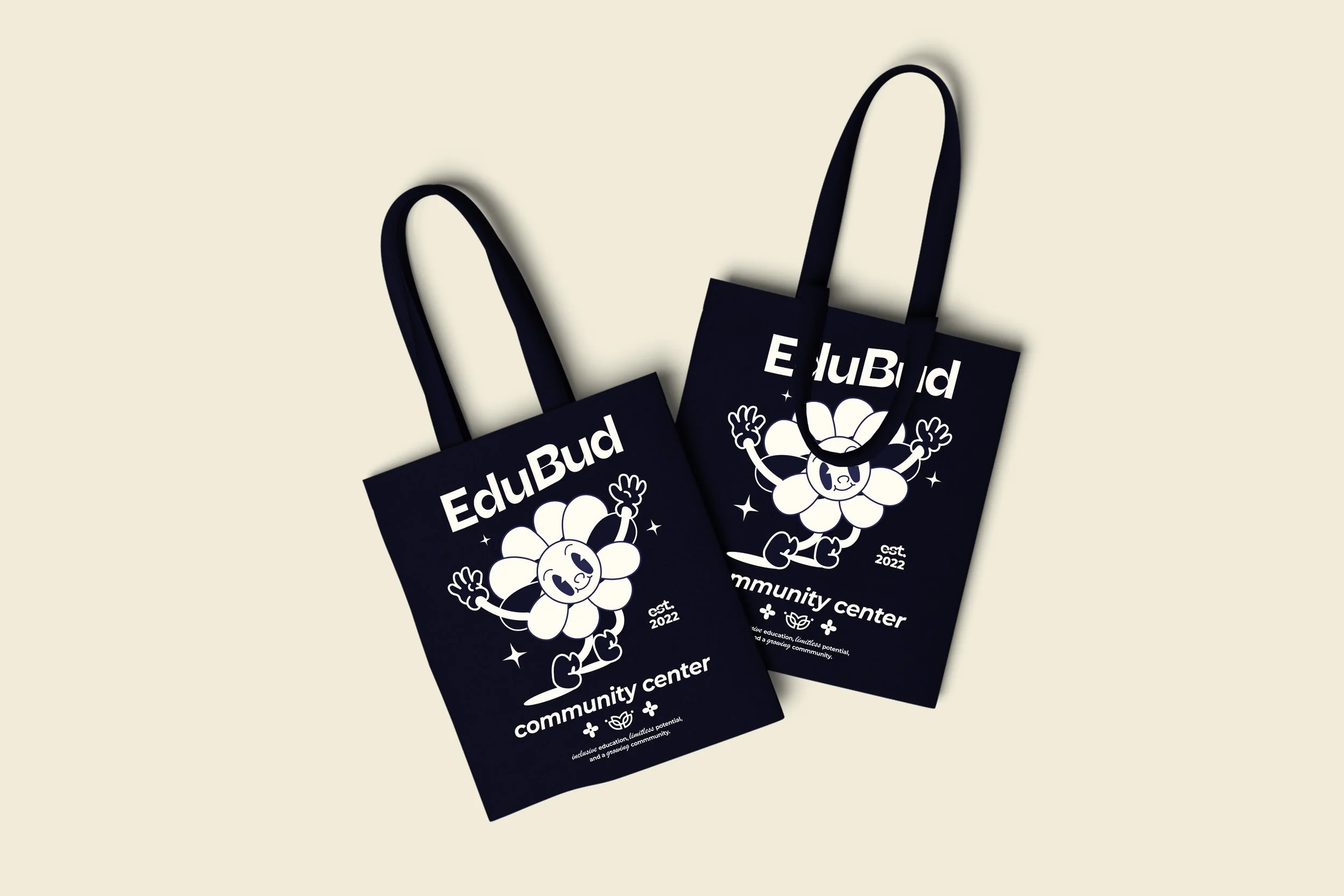
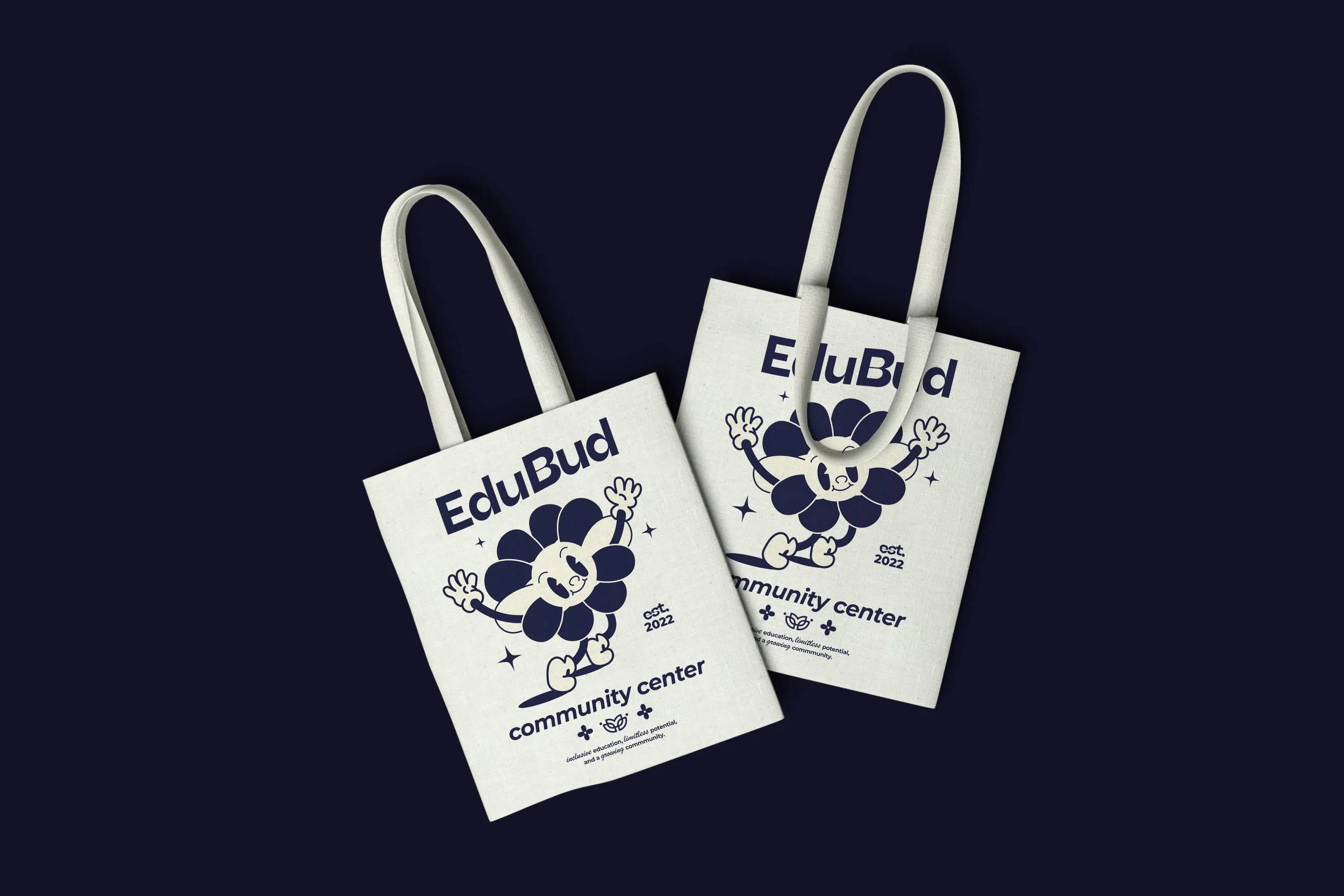
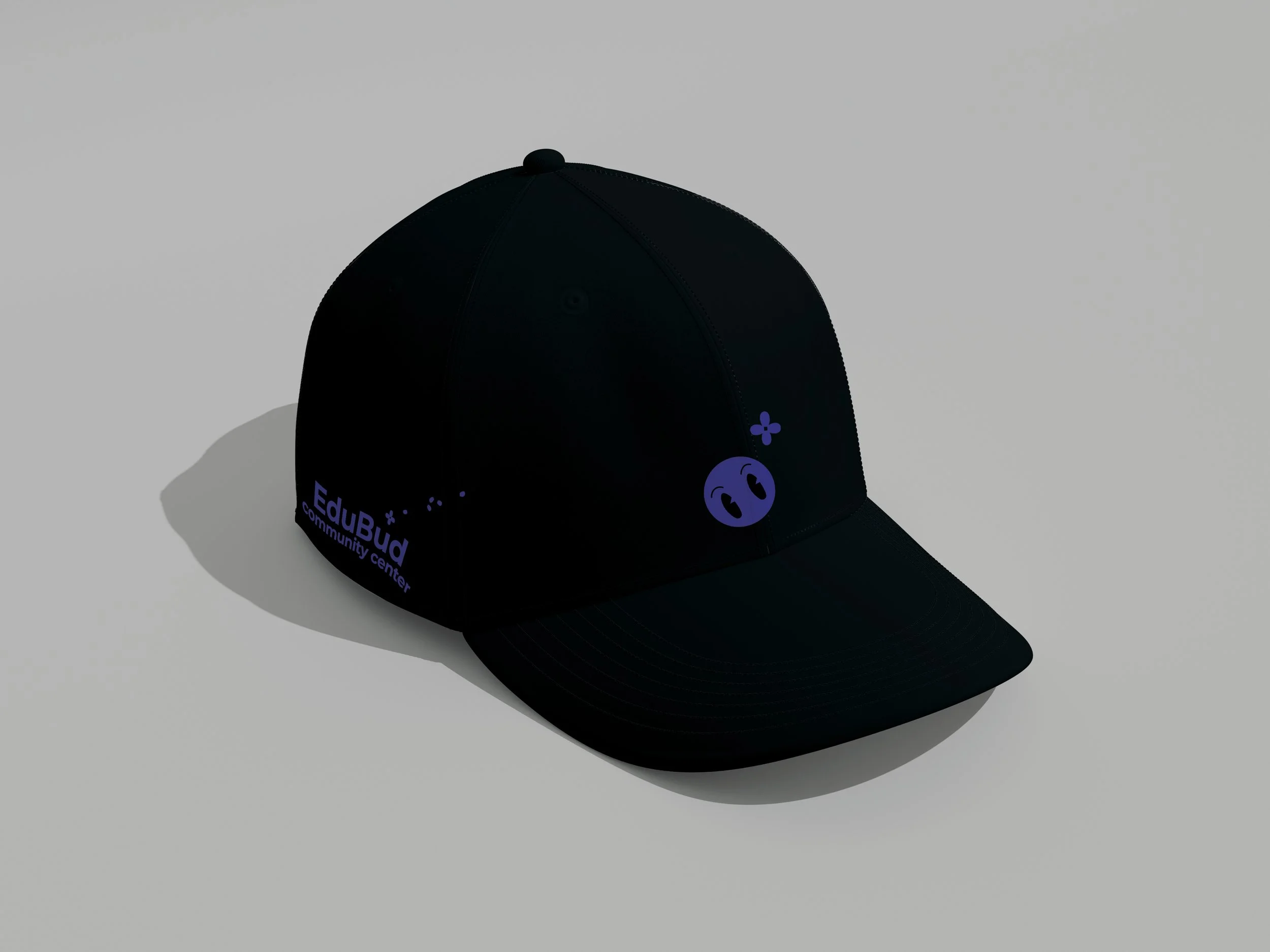
EDUBUD
IV. COMPLETE VISUAL IDENTITY
Developed a cohesive brand identity for Edubud, a non-profit community supporting individuals with disabilities. The project includes a custom logo, flyers, brochure, and merchandise, centered on an inclusive, uplifting visual language that communicates growth and empowerment.
Brochure

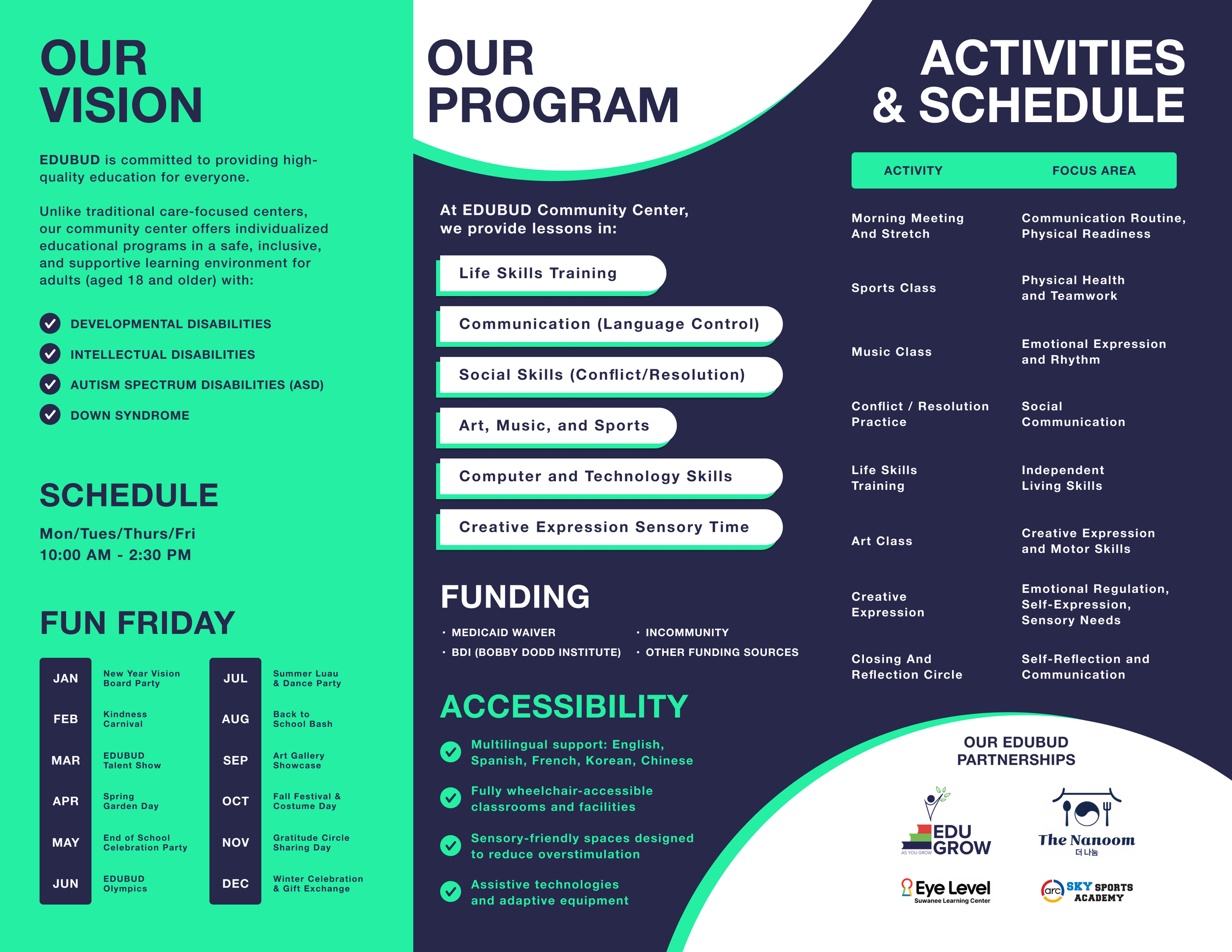
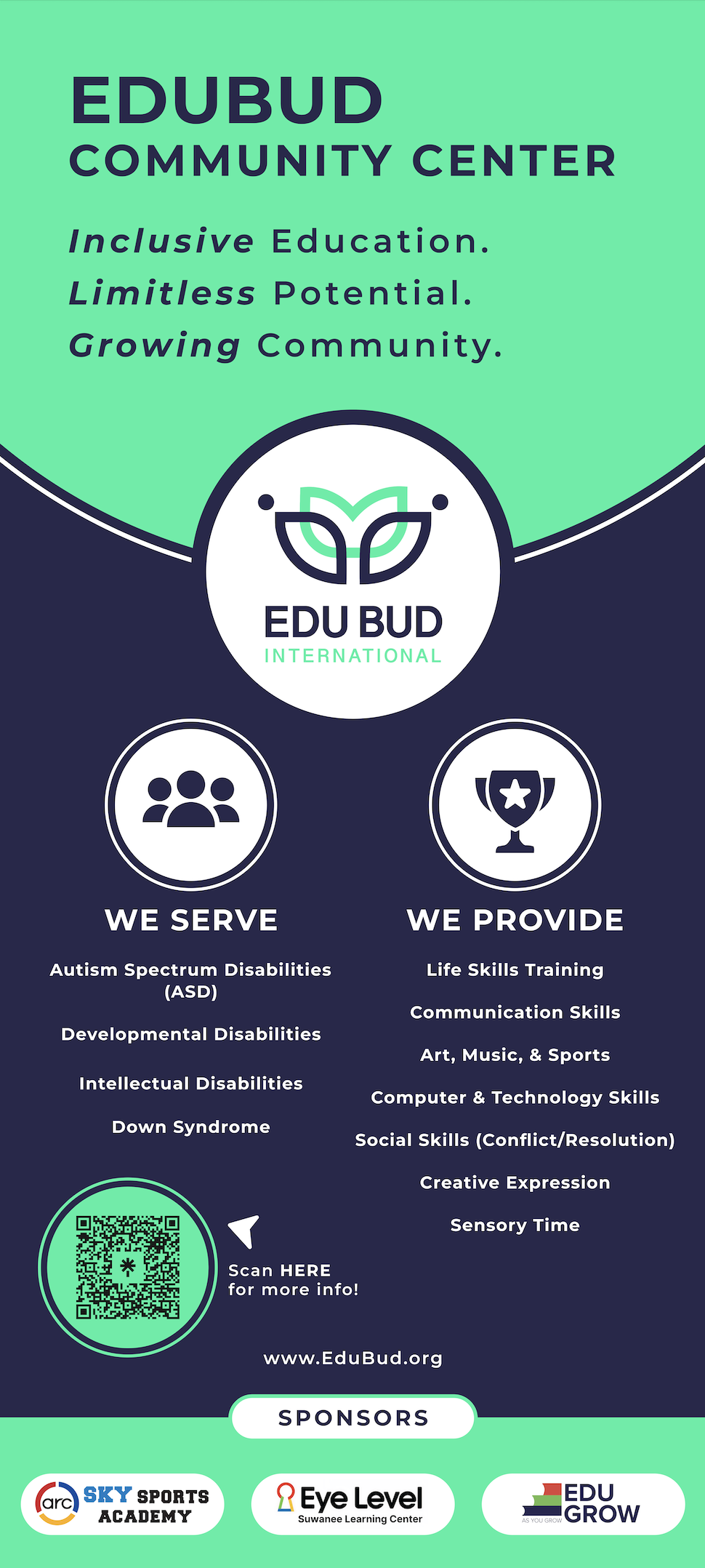
Standing Poster


Flyer

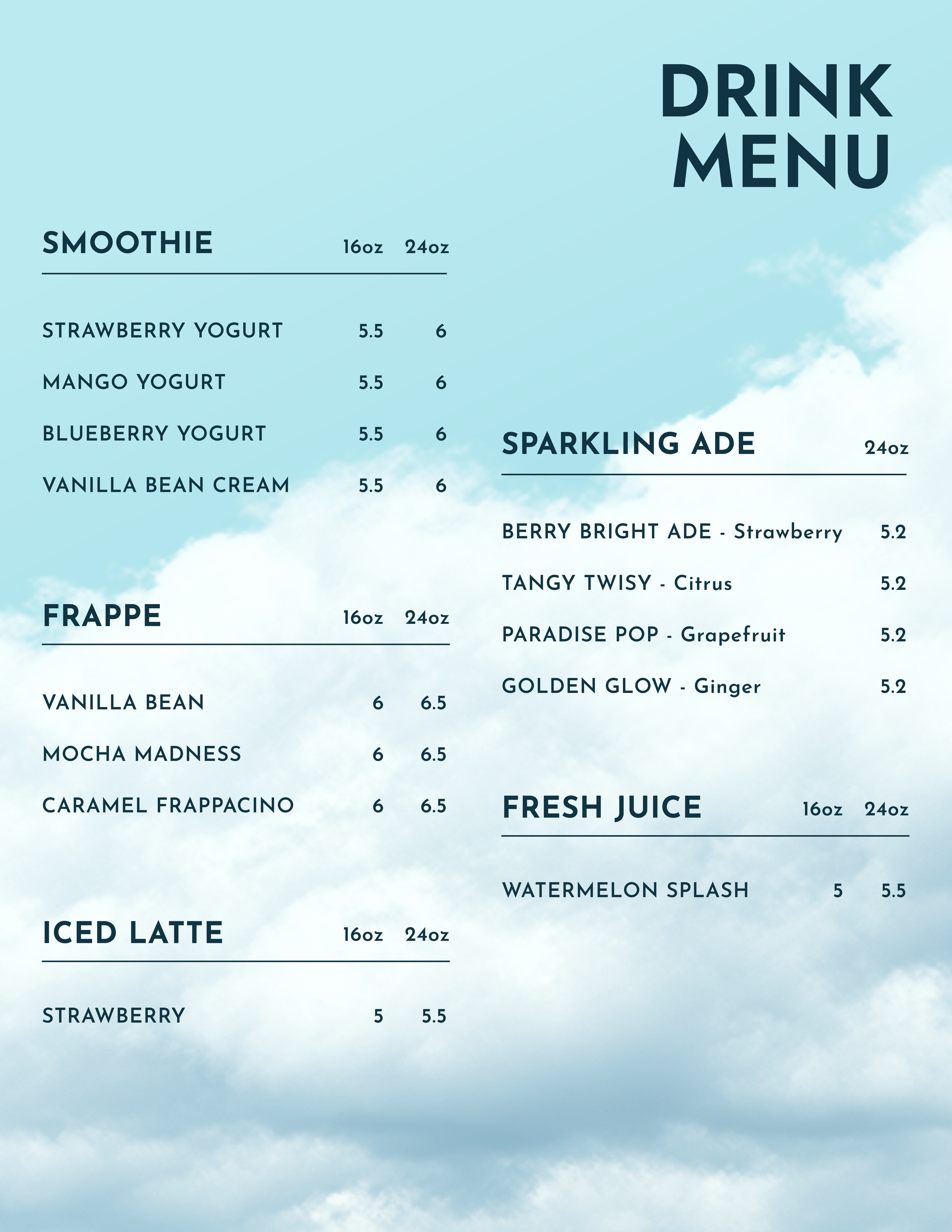
TOWER CAFE
V. SUMMER DRINK POSTER & MENU DESIGN
Designed a poster that evokes an immediate sense of refreshment through bright summer blues and vivid, thirst-quenching visuals, digitally crafted to resemble a real-life drink scene.


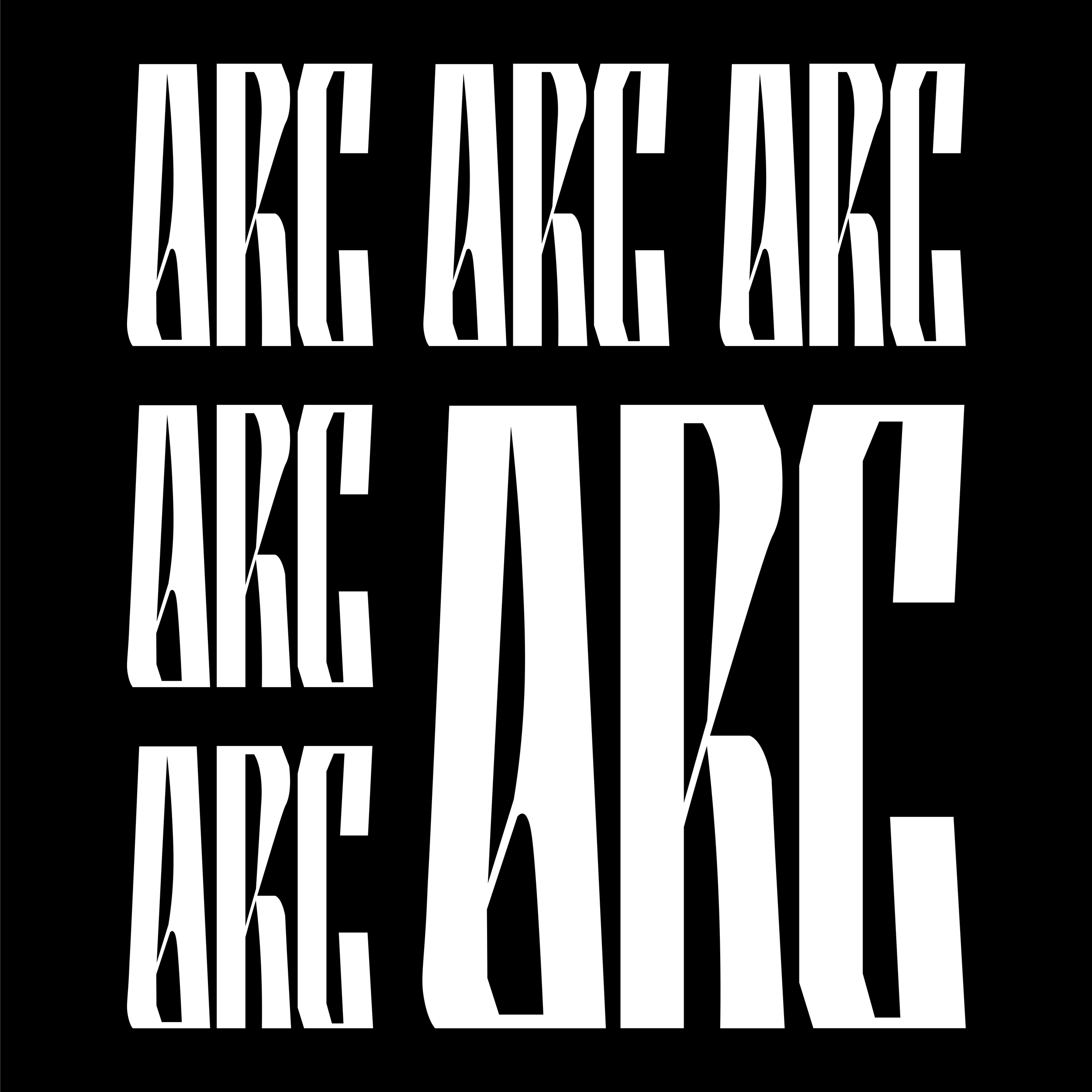
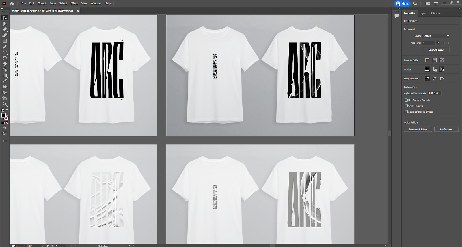
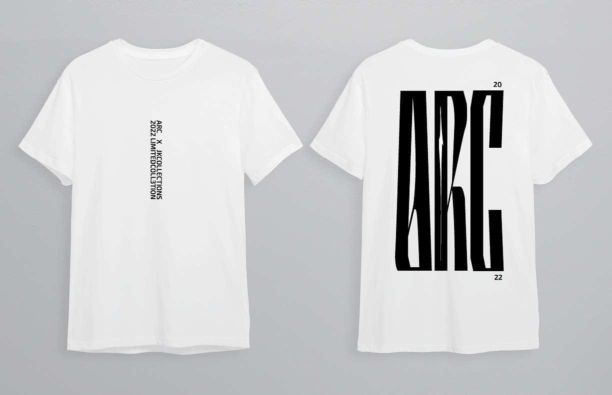
ARC (ATLANTA RUNNING CLUB)
VI. LOGO & T-SHIRT DESIGN
Created a dynamic identity for ARC, a running club, including a hand-drawn and vectorized logo that embodies motion and energy. Developed complementary t-shirt designs that translate the brand’s spirit into wearable graphics, combining clean vector forms with the organic feel of hand-drawn elements to capture the community, speed, and momentum of the club.

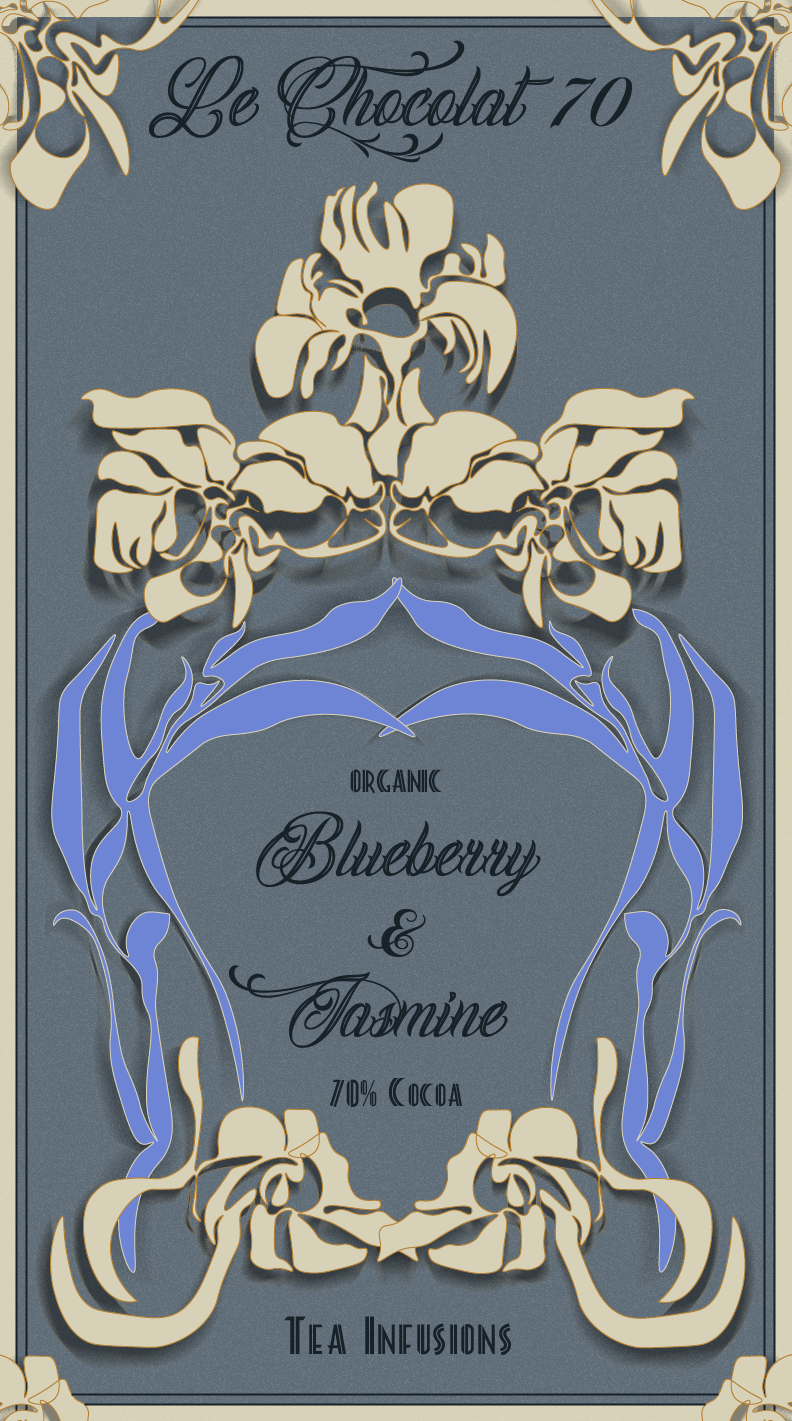
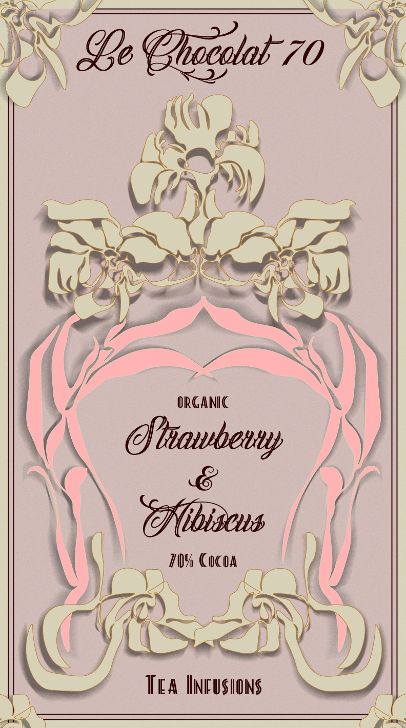
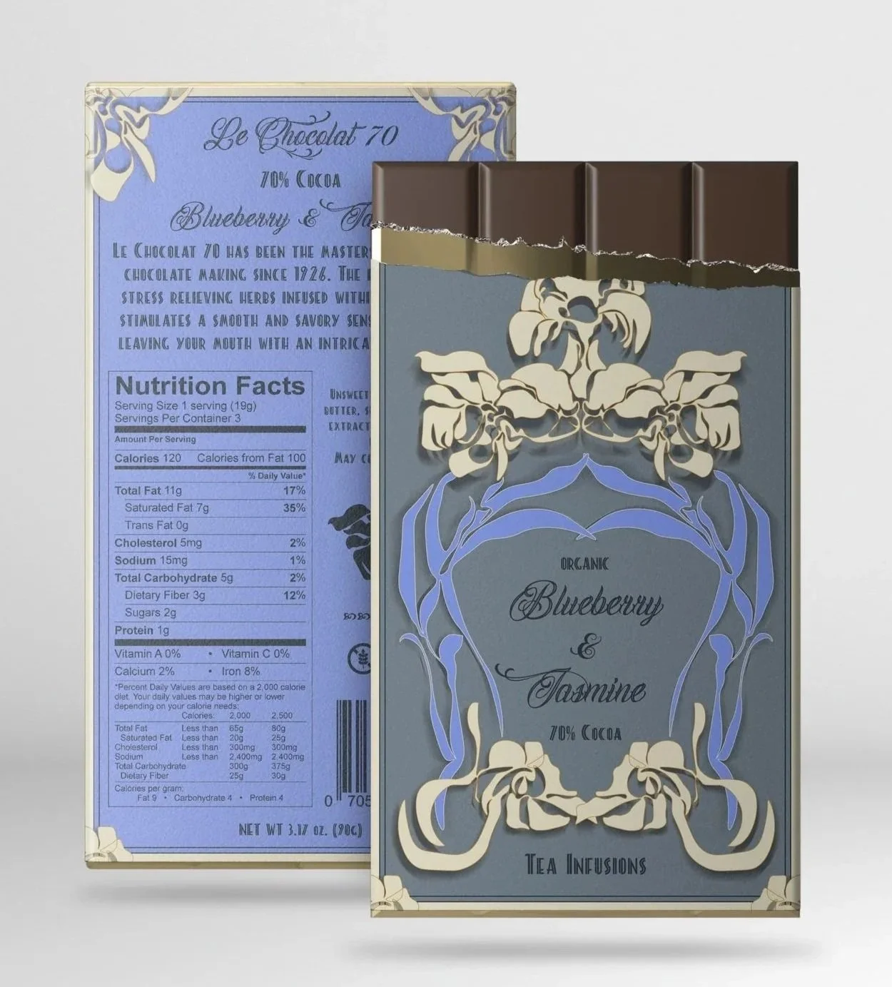
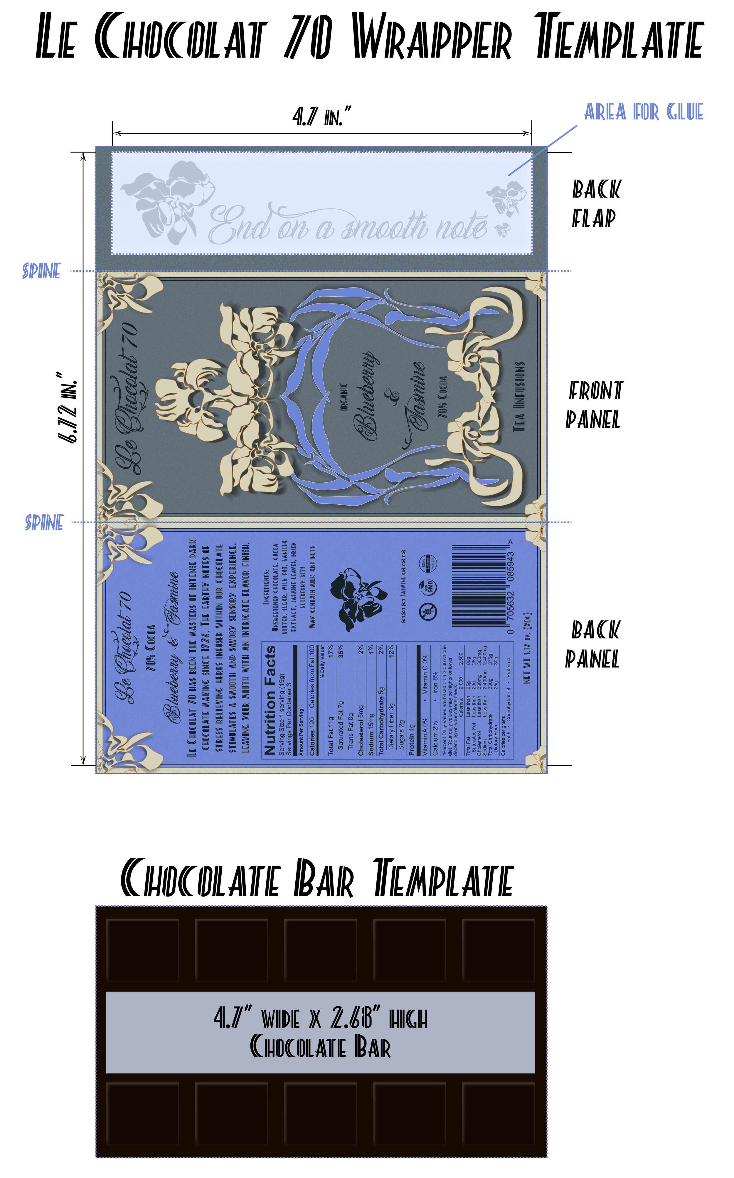
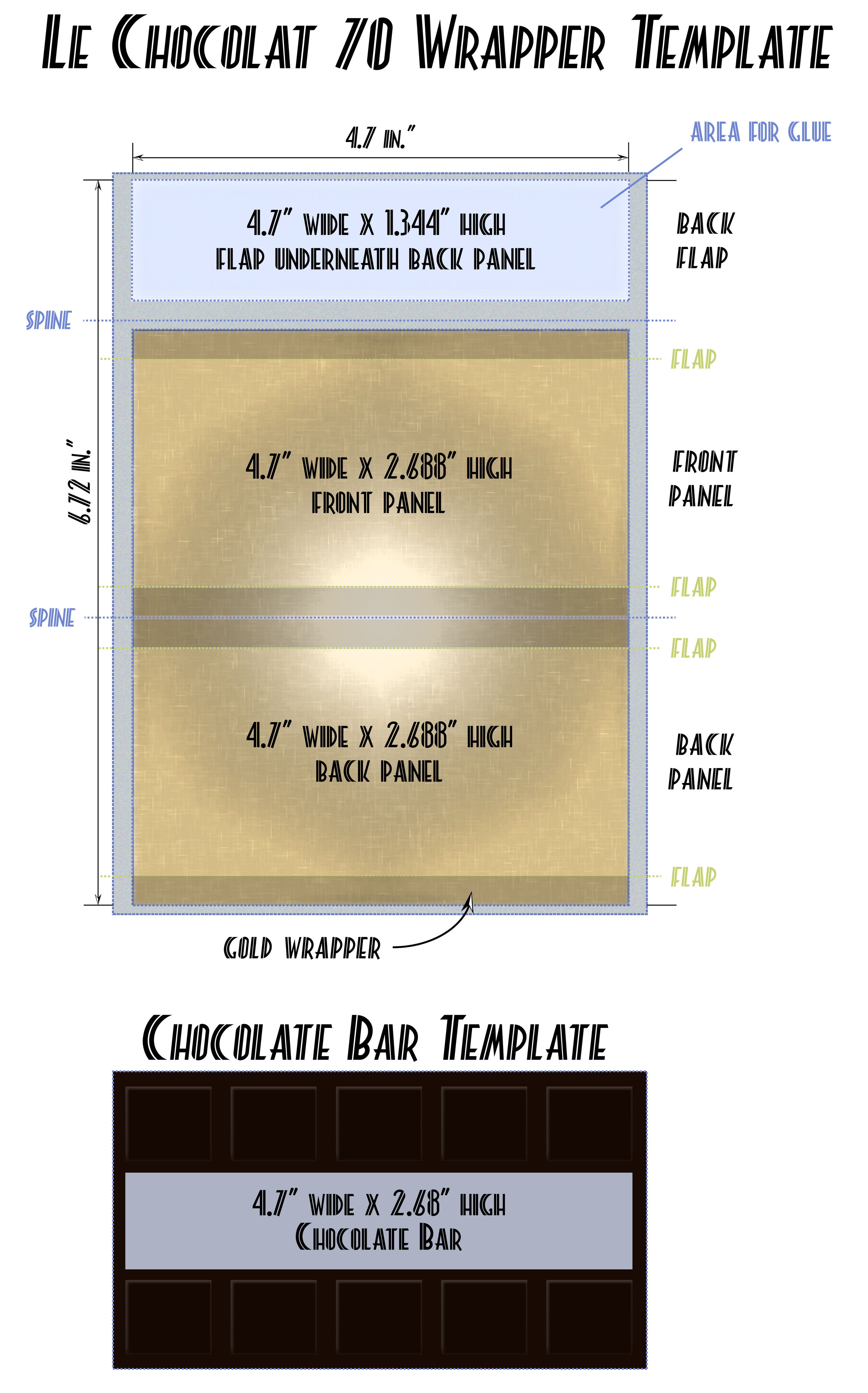
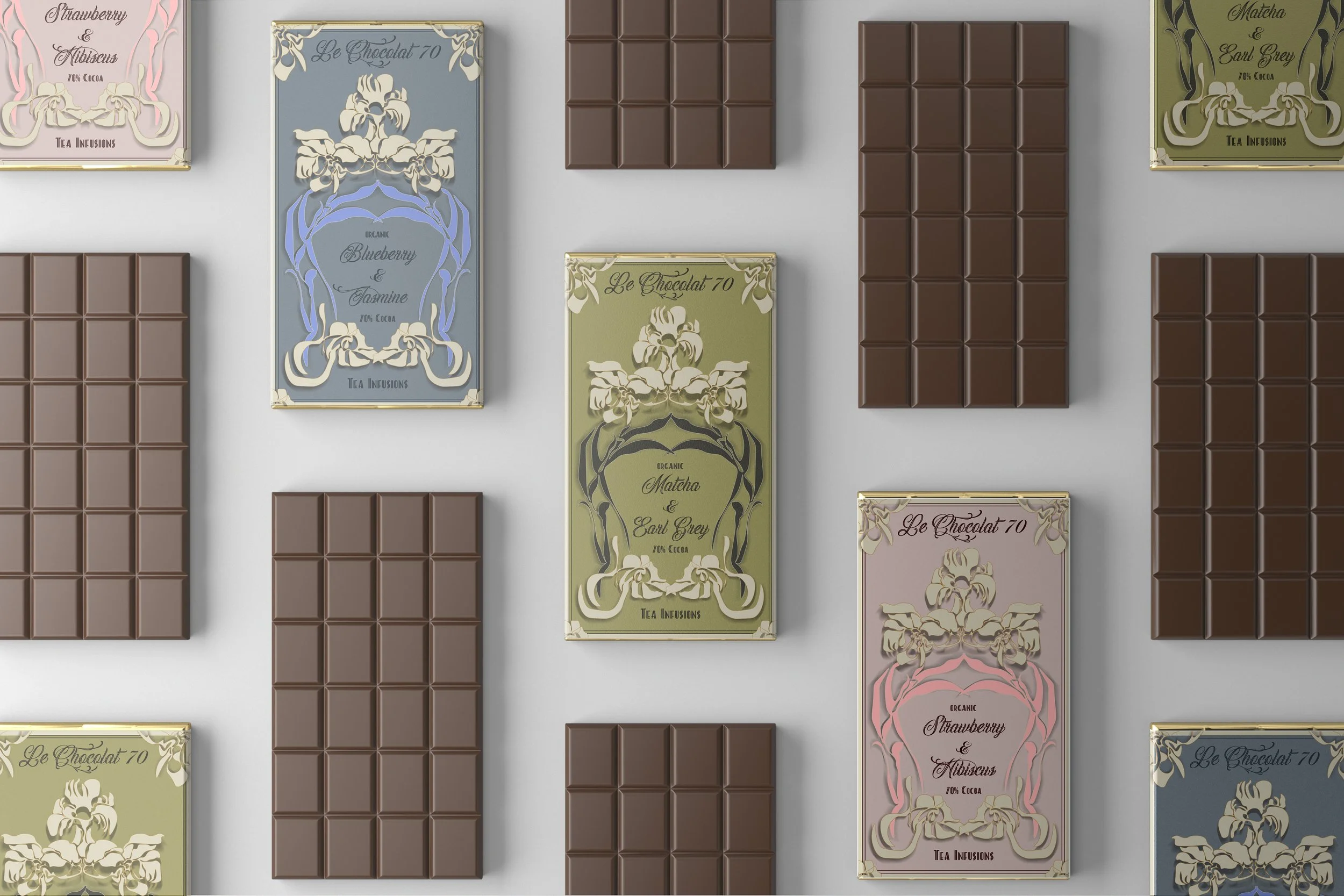
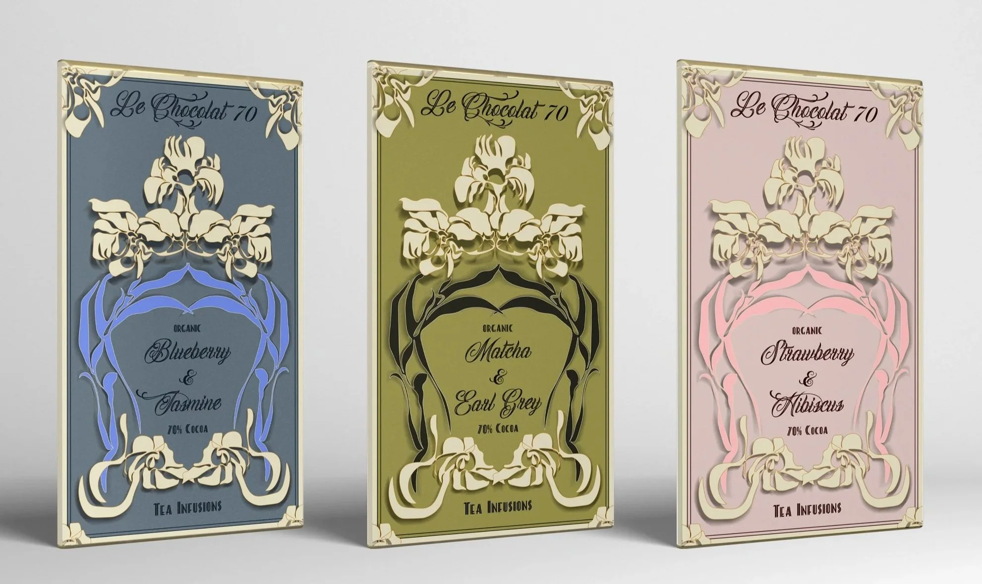
LE Chocolat 70
VI. ILLUSTRATED PACKAGE DESIGN
Developed hand-drawn floral illustrations with vintage-inspired aesthetics, which were digitized into packaging for luxurious chocolate bars, conveying sophistication and artisanal craftsmanship.

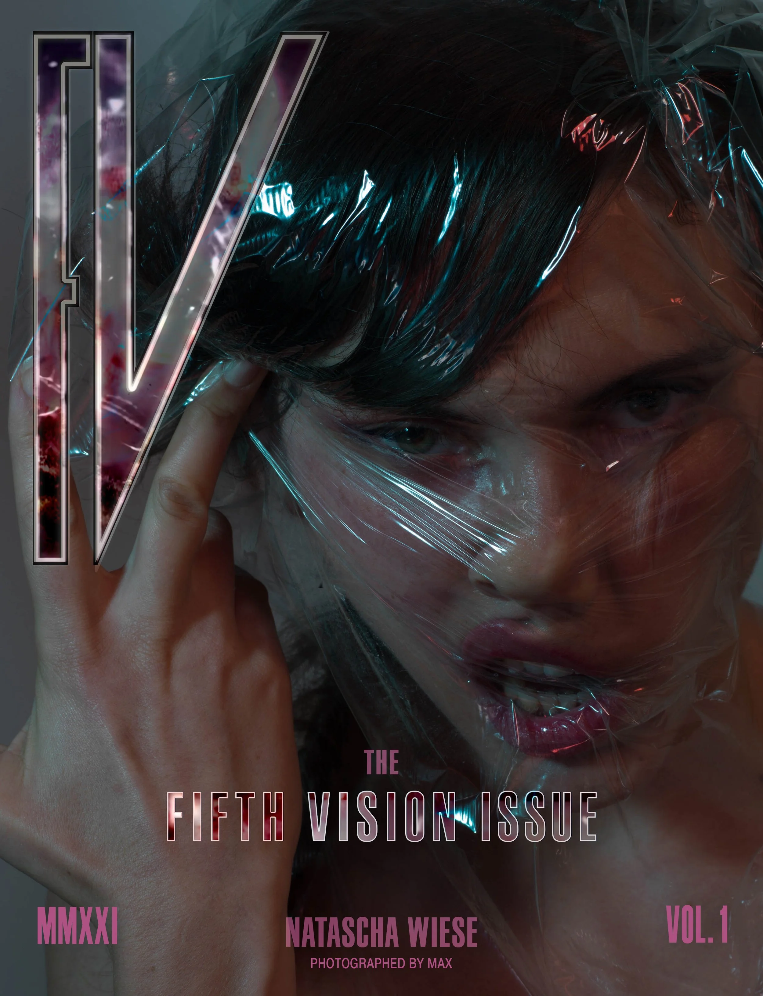
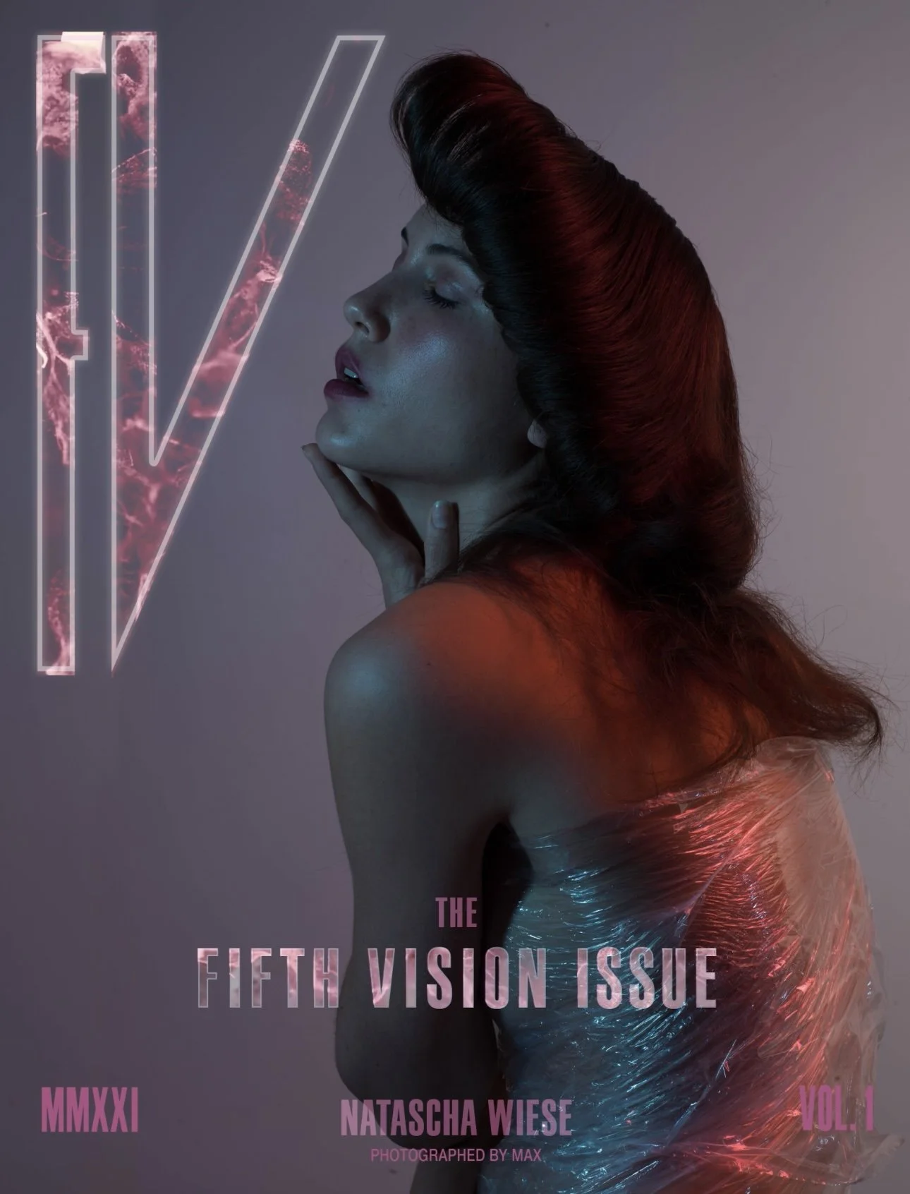
FV MAGAZINE
VII. MAGAZINE COVER (PRINT + DIGITAL)
Created a magazine covers for both digital and print, incorporating bold, dynamic graphics that capture the magazine’s quirky and edgy personality.

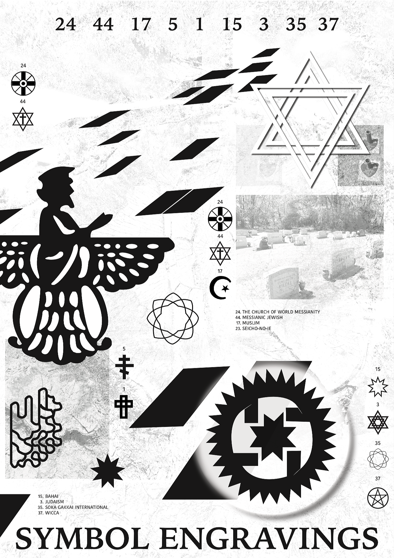

Symbol Engraving Poster: A historical poster where carved Jewish symbols rise from aged stone, enriched with dramatic light and shadow to reveal sacred depth.
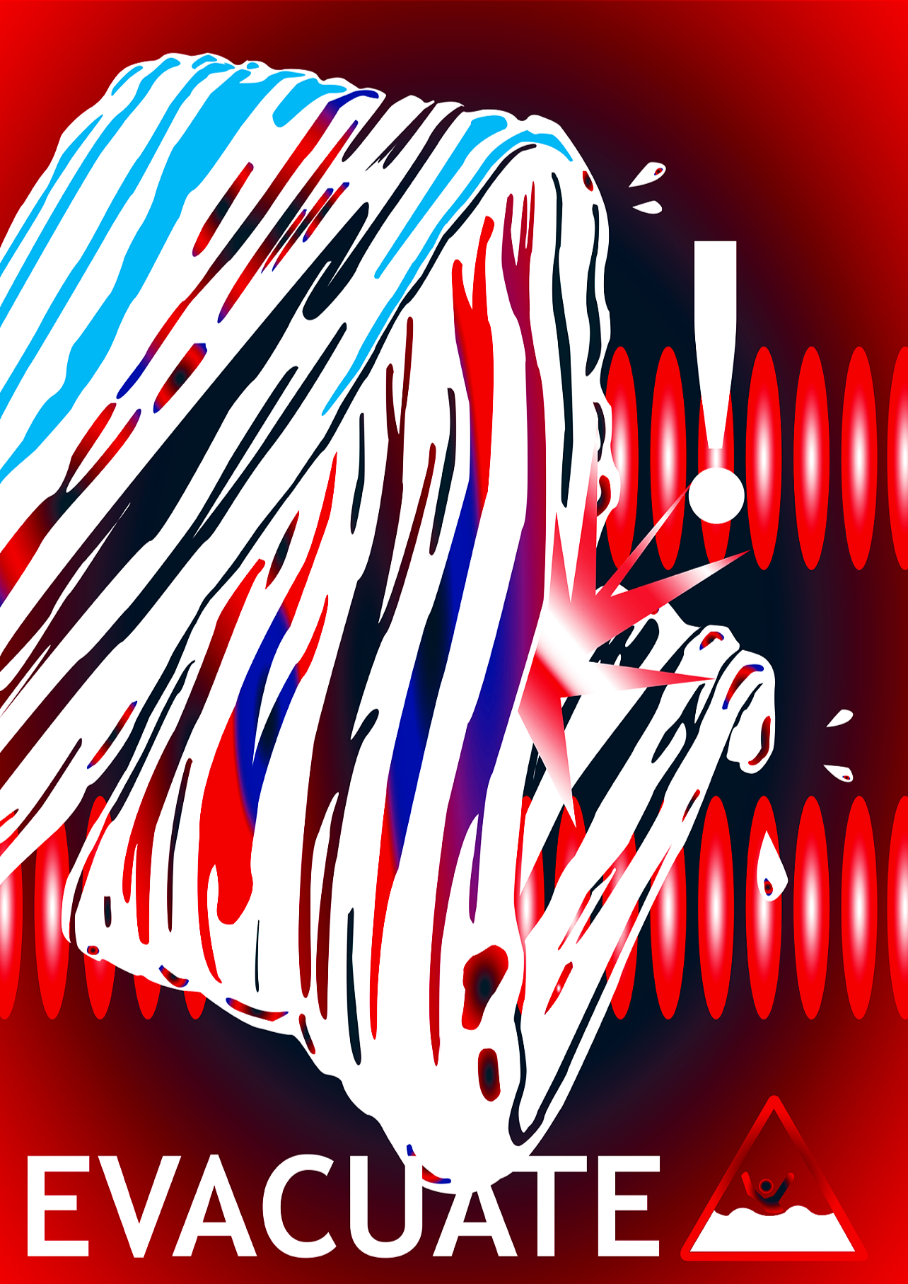
Evacuation Poster: An urgent evacuation poster with bold symbols, sharp vibrant colors, and fast-motion graphics to signal immediate action.
Rashomon Poster: A striking poster depicting four masks, symbolizing human deception and the elusive nature of truth. It captures the film’s exploration of ego and the struggle to face oneself.
Typography Poster: A study in typography, showcasing beautiful composition and thoughtful type design.
VIII. GRAPHIC POSTERS

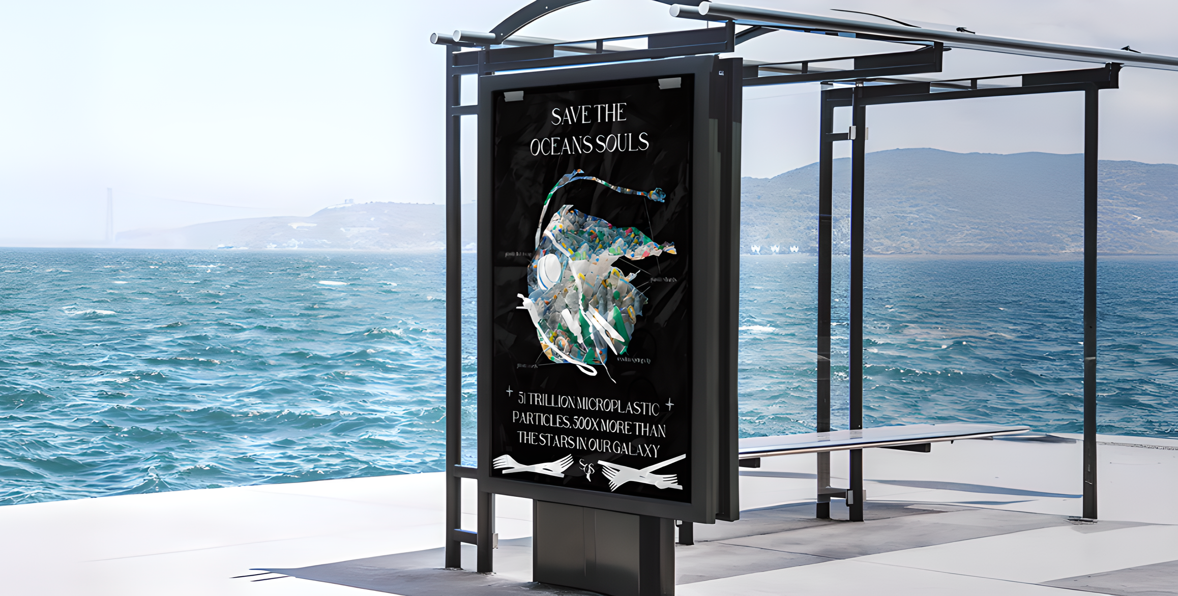
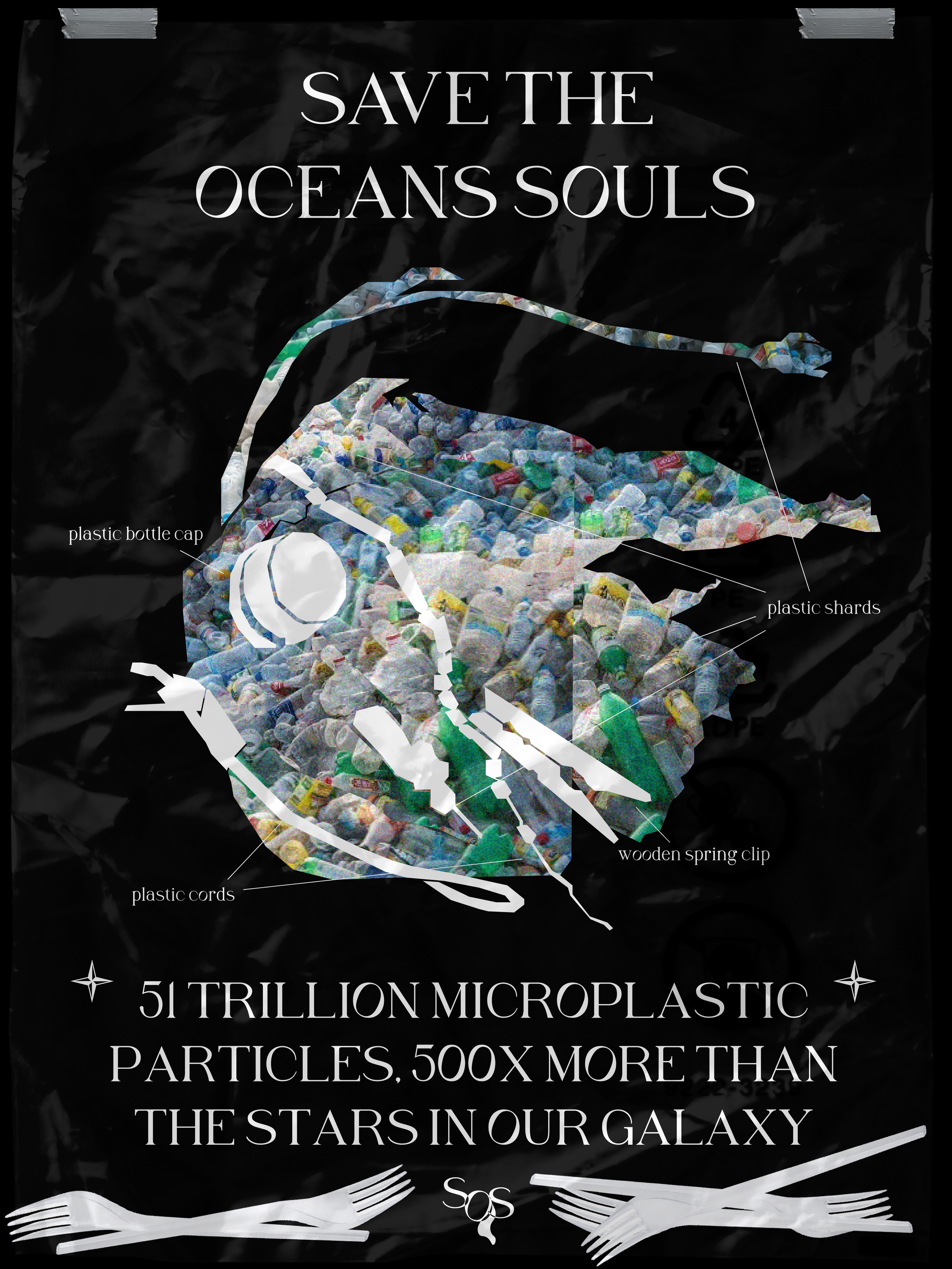
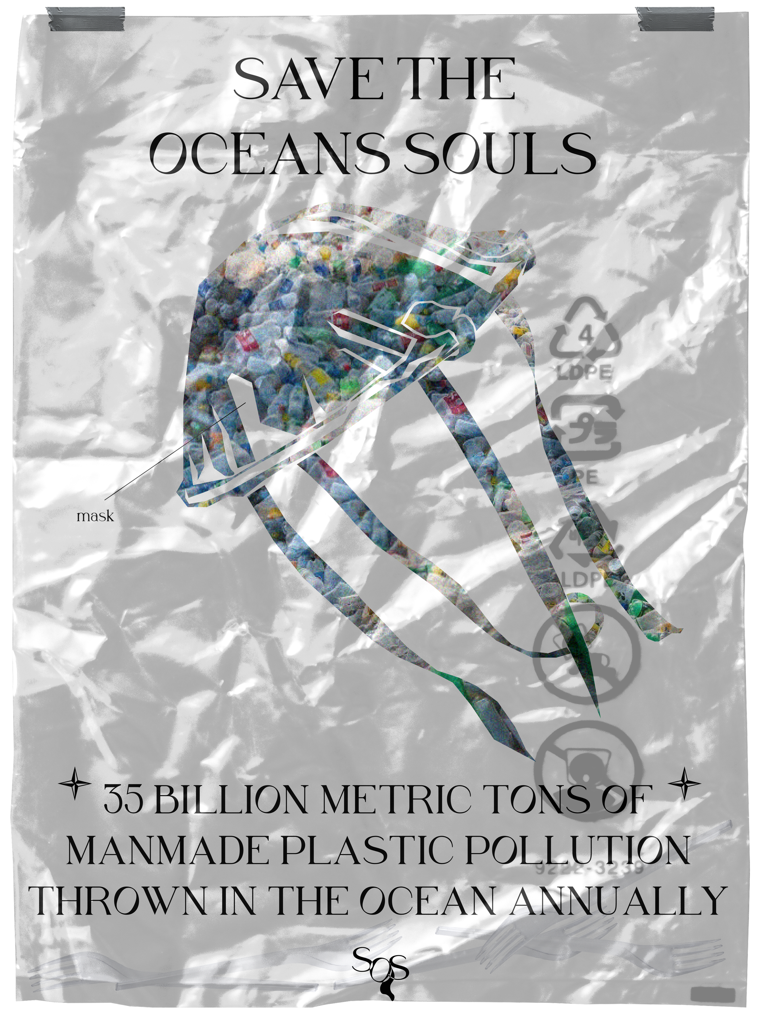
SAVE THE OCEANS SOULS (S.O.S)
IX. PERSONAL POSTER IDENTITY
Developed a personal poster series addressing pollution, using ironic storytelling to encourage people to stop littering and protect wildlife. The visuals illustrate how pollution ultimately affects human health. Posters were designed for placement in high-traffic areas near beaches and other litter-prone locations.